Hidden Meanings And Secrets In Recognizable Logos That Our Eyes Definitely Missed
Sometimes design is obvious and loud. Other times, it’s so subtle that you won’t notice the little things unless you really pay attention to the art. The same can be said for texts and logos on brands that we see daily. Maybe it’s because we see these symbols so often that we never notice their deeper meaning, or the little Easter eggs embedded within them. But these next few images are going to show you just how intentional and clever the design for these symbols are. The next time you’re paying with pennies, watching a TV show, or buying ice cream, pay attention to the logos of the brands. You might realize a thing or two that you’ve never noticed before.
Beats by Dr. Dre
If you’re familiar with this particular brand of headphones, you’ll recognize its iconic red logo. At a glance, it may just look like a white lower case “b” inside a red circle. What’s so special about that, right? Of course, it would be a “b” because the brand is called Beats.
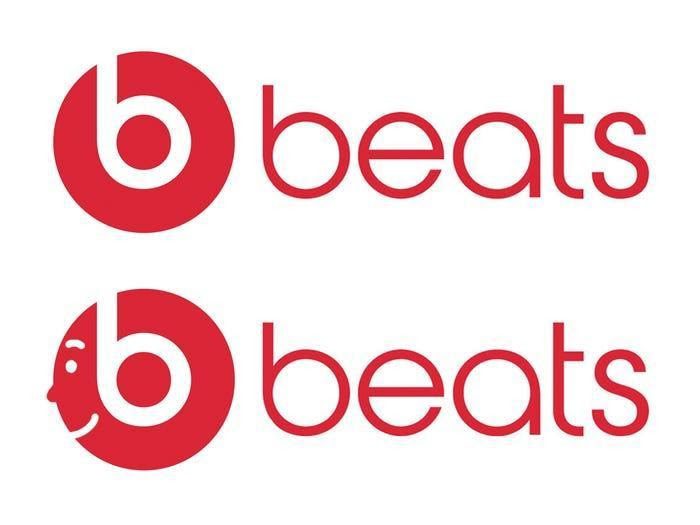
But if you use your imagination, you can see that the icon has a double meaning. Not only does the letter represent the name of the brand, but it also represents the product! The symbol is a side profile of somebody wearing headphones. How cool is that?
Bread tie colors
Have you ever noticed that bread ties come in different colors? Some are white, some blue, others red. This isn’t just a coincidence. It’s also not a creative decision. They didn’t do this to give the supermarket aisles a pop of color.
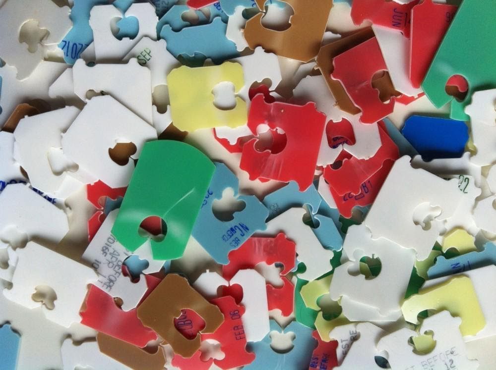
The color of these bread tags indicates how fresh the bread is! For everyone who’s still turning the tag around to look at the expiry date, all you have to do is look at the color to know when to use the bread. Blue is usually Monday, and green is Tuesday.
The eight of diamonds
To all the card players out there, have you ever noticed this? Or have you just been too busy gunning to win to pay attention? One particular card has a hidden image in its design. Pull out an eight of diamonds and see for yourself.
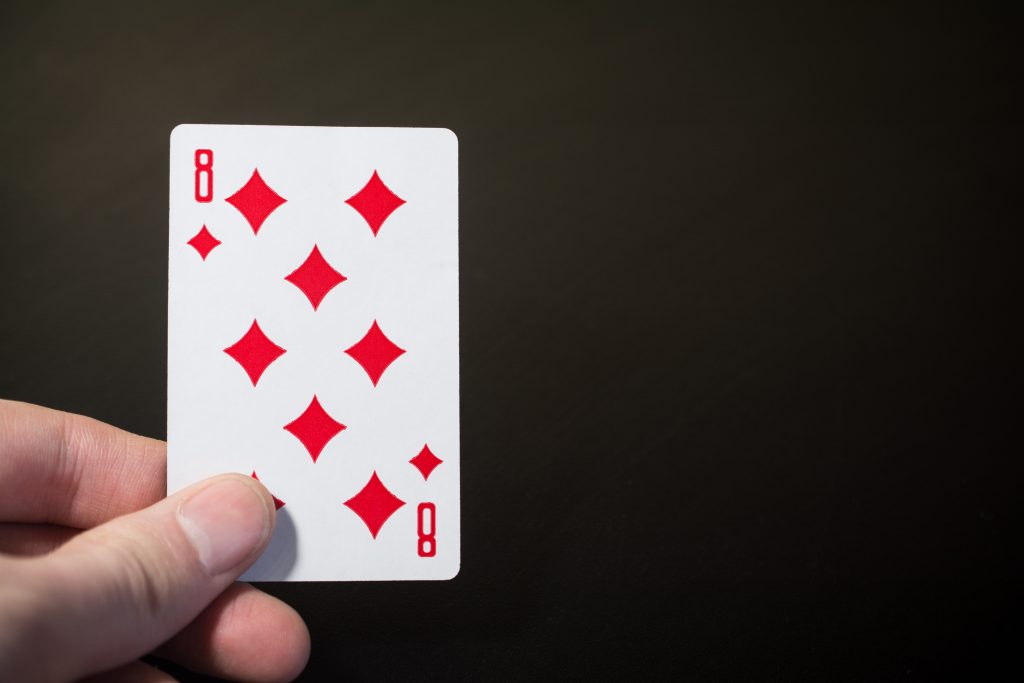
If you look closely, the white space between all those diamonds in the center creates the number 8. Do you see it now? What a clever way to design these cards. But of course, no one has ever noticed this before.
Le Tour de France
Many designers employ a similar approach to creating logos. They would often try to hide or incorporate an image into the text of the brand name. This logo for the Le Tour de France cycling race is one example of that.
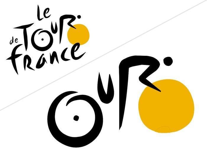
Because it’s for a cycling event, the designer incorporated an image of a person cycling on a bike into the word “Tour.” See how the two ‘O’s’ form bicycle wheels, the ‘U’ a bike seat, and the ‘R’ a person? How clever!
Toistos
Chips and salsa lovers, have you ever paid attention to the Tostitos logo on the salsa jars you buy? It’s more than just the name of the brand. Look closely at the “TiT” right in the center of the logo. What do you see?
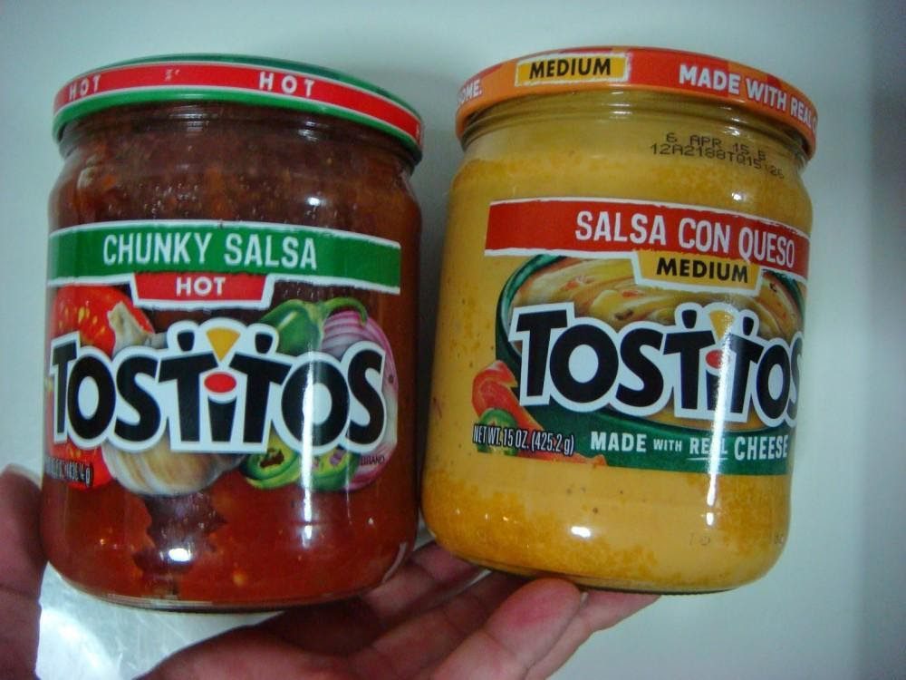
Yup! Those letters also form an image of two people sharing a chip and a bowl of dip. The dot of the “I” makes up the bowl of salsa! How creative is this? We would never have thought of this ourselves.
Bluetooth
We’re so familiar with Bluetooth technology now that we pay no mind to the actual logo or why it’s called Bluetooth in the first place. When you think about it, the word has nothing to do with the purpose and function of the technology, much less the symbol.
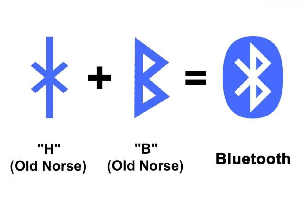
As it turns out, the team behind this technology was researching about Vikings when they discovered that King Harald Gormsson was nicknamed “Bluetooth.” Somehow, the name just stuck! The design is a combination of the letters ‘H’ and ‘B’ in old ‘Norse’ and stands for Harald Bluetooth.
Toblerone
This beloved chocolate has been around for decades, and yet nobody has noticed the hidden image etched within the packaging of every single Toblerone chocolate bar. Hailing from Switzerland, it makes sense that the imagery would involve the Swiss mountains.
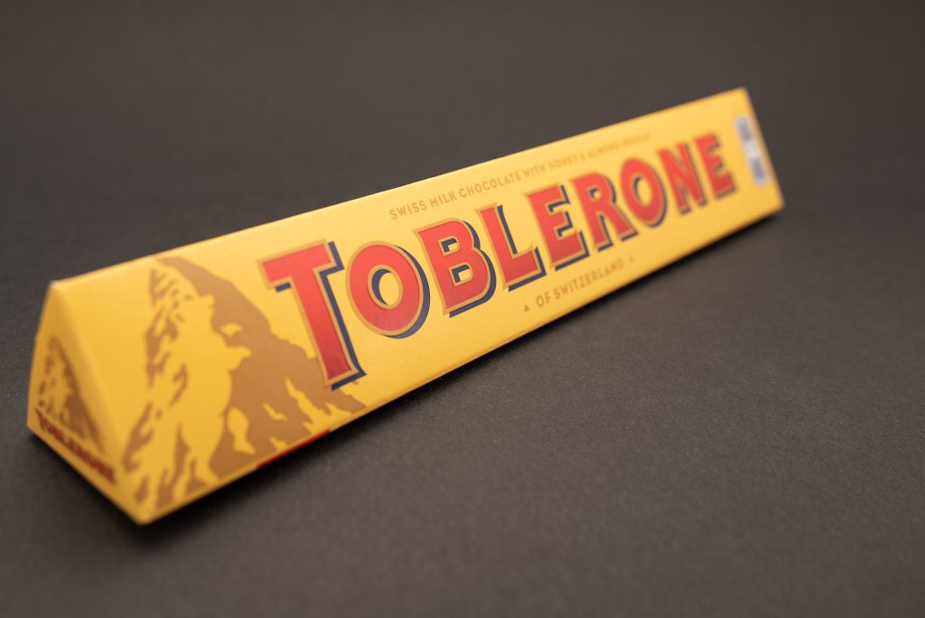
But has anyone ever seen the bear on the mountain? Yes, the bear! Toblerone specifically originated in the Swiss town of Bern, which has a bear on its coat of arms. So, of course, the packaging of the chocolate had to pay homage.
Toothpaste
This tiny detail may miss even the most attentive and curious of eyes, mainly because brushing your teeth is such a mundane task. Allow us to point this out to you: the backs of toothpaste tubes have different-colored tabs on them.
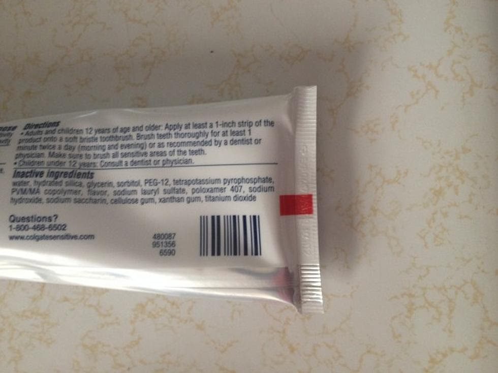
These tabs may seem to serve no useful purpose, but it actually lets you know the ingredients present in your toothpaste. A black tab means that the toothpaste contains a larger percentage of chemicals. A red tab means it contains more natural ingredients.
Baskin-Robbins
Ice cream is one thing we can’t get enough of, so much so that we don’t really care what the logo looks like, as long as the ice cream is tasty! But here’s a fun fact about the logo for the beloved ice cream brand, Baskin Robbins.
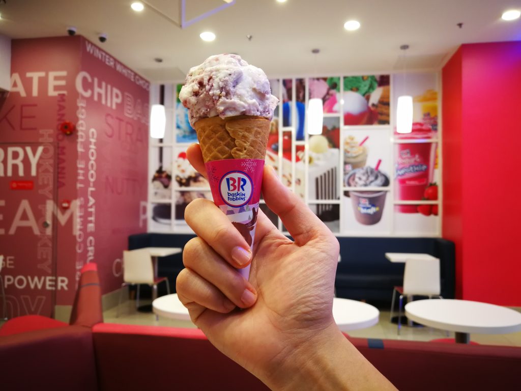
Burt Baskin and Irv Robbins joined their individual ice cream ventures in 1953. When combined, they realized they had 31 flavors in total. The number was incorporated into the logo. Notice the pink strokes on the “BR” make up the number 31!
Amazon
The notorious online shopping platform Amazon started out as an online bookstore. Before it became the source for all things from clothes to electronics, it solely provided the public with books from A to Z, and that’s the reason behind the logo!
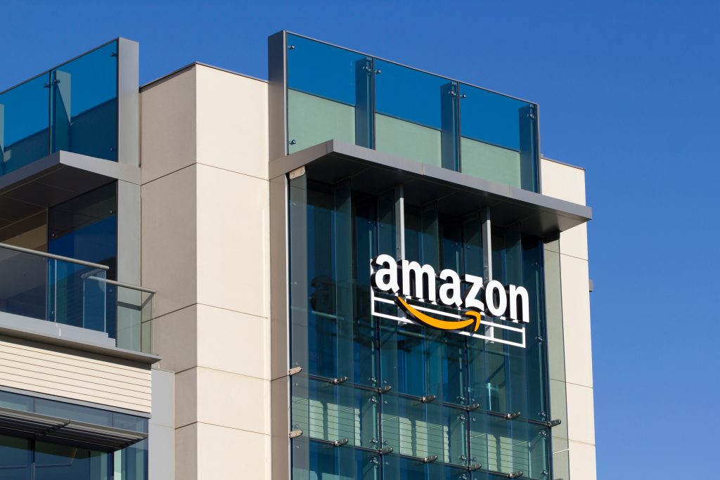
Amazon’s logo was birthed in the year 2000. The yellow arrow aligns with the ‘a’ and ‘z’ to represent the variety of products. However, as the brand expanded to sell other things, the logo just stuck. Technically, it’s still accurate, as Amazon now provides us with almost anything, from A to Z.
Northwest Airlines
This airline was founded in 1926. It stood on its own until 2008 when it merged with Delta Airlines. Its logo remains the same, though: the letters “nwa” with a hard-to-decipher symbol that may mean nothing at first glance.

However, the gray circle and red inverted triangle are actually super minimalist designs. It resembles a compass, the arrow of which is pointing north-west. It’s so subtle that it may not seem like anything at all until you realize its relation to the name of the airline.
Makeup and beauty products
If you’ve ever purchased beauty products, you may have the same problem everyone else has: you don’t know when it expires! Makeup products are notorious for not having the expiry date on the packaging. But this is just because you don’t know where to look.
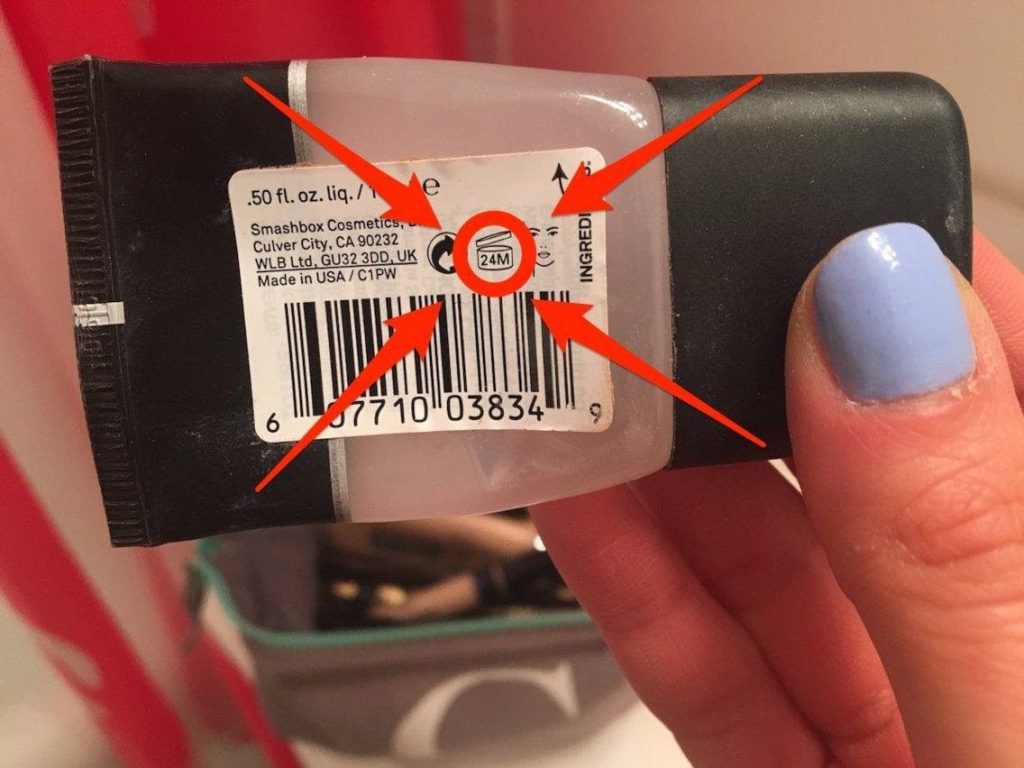
The tag on the products will normally have a photo of an opened product with letters and numbers on it. This isn’t just some random image. This actually the PAO, or Period After Opening information. This product is good for 24 months after opening.
Since the launch of Pinterest, vision boards have moved from bedroom walls into the palm of our hands. Pinterest’s brand name in itself is a clever combo of the words “pin” and “interests” – summing up what a vision or mood board is.

Did you notice that the logo is also representative of the app? It may just look like a white ‘P’ inside a red circle. But the ‘P’ is designed to look like a pushpin, which people would normally use to pin stuff up on a vision board!
The Coca-Cola polar bear
Coca-Cola has existed for decades. While we associate the brand with their delicious soda and that Coca-Cola red, there was a time in the past when they used polar bears as a mascot. The cans even had these specific ones on them.
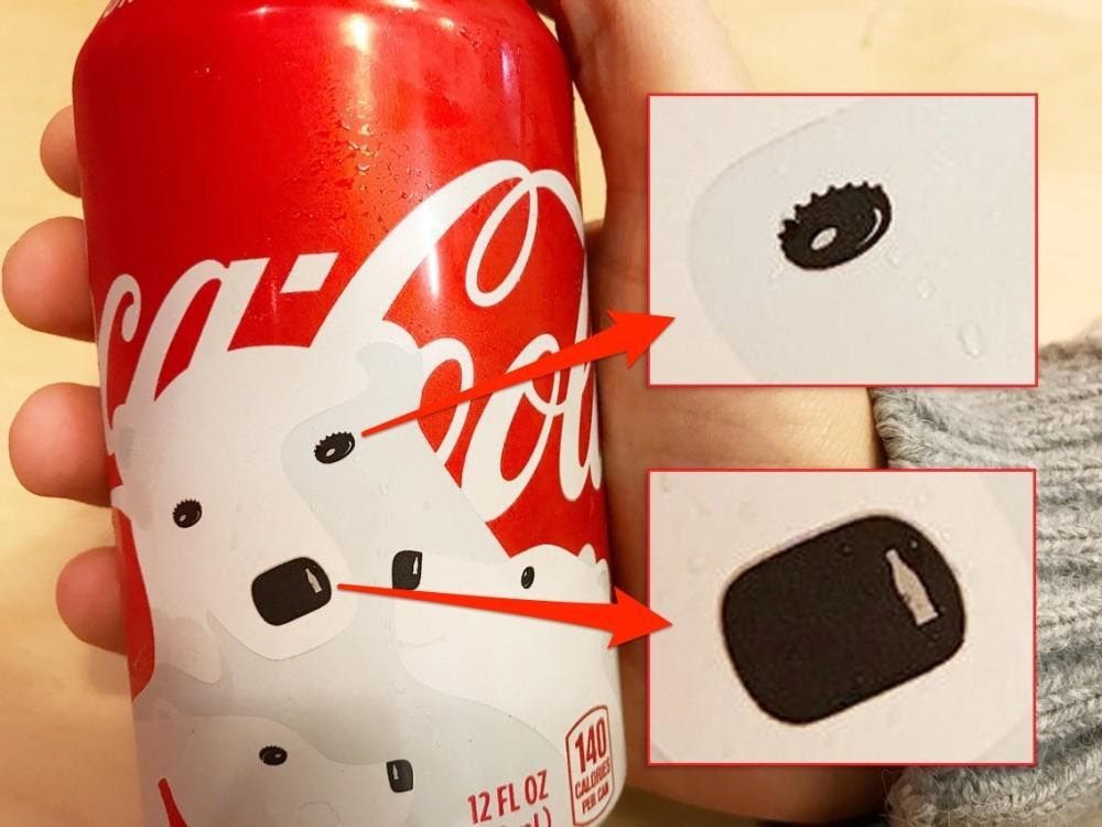
The brand has since dropped the polar bears because consumers complained that the cans were white instead of red. However, take a close look at the bear. Its eyes look like bottle caps, and the highlight on the nose is in the shape of a classic Coke bottle!
The Coca-Cola logo
Speaking of Coca-Cola, someone discovered that there was a hidden logo within the text, which wasn’t intentional at all. Because the text of the logo is in cursive, the letters criss-cross with each other as they connect together. Check it out!
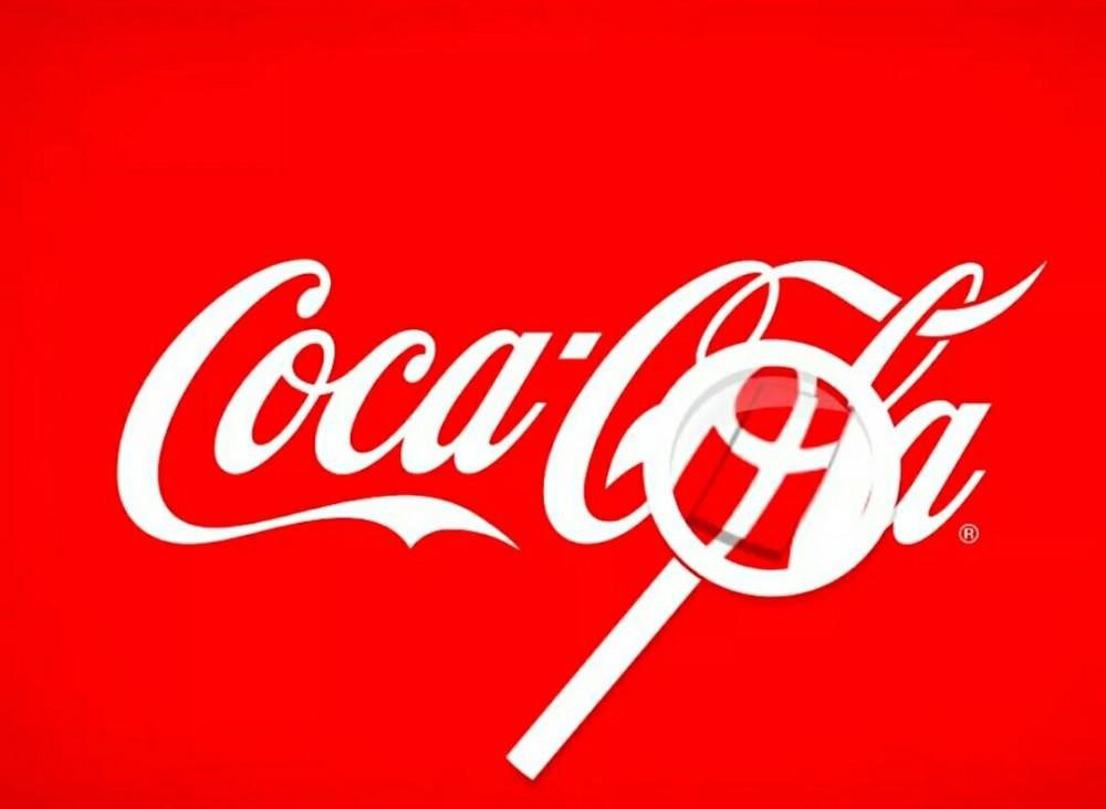
In the word “Cola,” the cursive bound together to form something resembling the Danish flag! Do you see it right there? This was not the intent of the brand or the designer, but PR and marketing used this happy accident as an excuse to create a campaign in Denmark’s busiest airport.
NBC
This media network started out as radio only. The logo has always been this colorful peacock, earning them the nickname “peacock network.” However, nobody really saw the logo as important or understood the nickname until the network expanded into television.
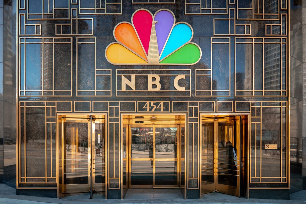
Once NBC started doing broadcast TV, the public saw the logo in all its glory—a peacock with feathers in the colors of the rainbow. It was created in 1956 but was only finalized as the formal NBC logo in the 80s as a symbol of the company offering color TV, which was revolutionary at the time.
FedEx
Here’s another instance where the logo contains a hidden image. FedEx is a delivery company that started in 1971. In its inception, it was called Federal Express. However, they shortened the name to FedEx in 1994. The new logo is intended to reflect their ethos of speed and accuracy.
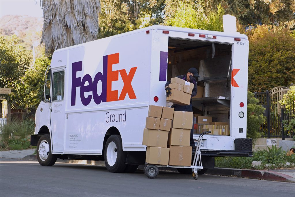
How did the logo designers achieve this? By hiding an arrow right in between the letters. Take a closer look at the “Ex” in the logo. The space between the two letters creates a perfect white arrow. This is a great use of negative space!
Hershey’s Kisses
Nothing says Valentine’s Day better than a smattering of Hershey’s Kisses. These bite-sized chocolates are beloved among many and come in a variety of flavors. But did you know that you get an extra ‘Kiss’ in every pack?
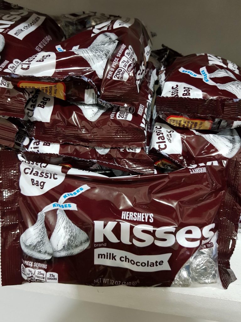
The extra kiss is in the logo. Much like the FedEx logo, the Hershey’s Kisses logo uses negative space to form a Hershey’s Kiss. The space between the K and I creates a shape similar to that of the individual Kisses, thanks to the font.
Subway
Quick and easy, Subway is the go-to fast food joint for many. It’s the best way to grab a quick lunch before your next meeting, or a hearty meal after a night out. The ability to customize your own sandwich is definitely a great selling point.
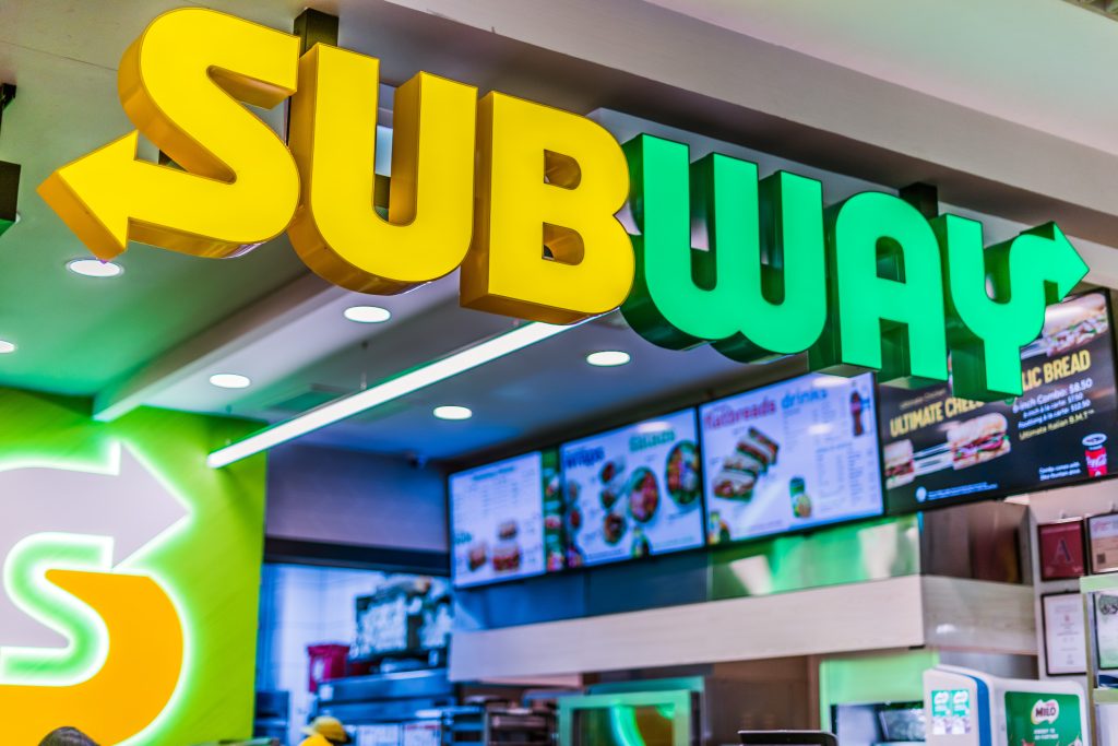
The subway logo is almost always in neon lights over the storefront. It’s meant to attract people in. Not only that, but it’s also meant to signify where to enter and exit. Notice the arrows on the logo. They point to the entrance and exit of the restaurant!
Hyundai
Logos for car brands normally comprise just the name of the brand, but once in a while, there will be a brand with an icon for a logo. Hyundai is one of those brands. Their logo may seem to be a simple ‘H’ inside an oval. But it stands for so much more than that.
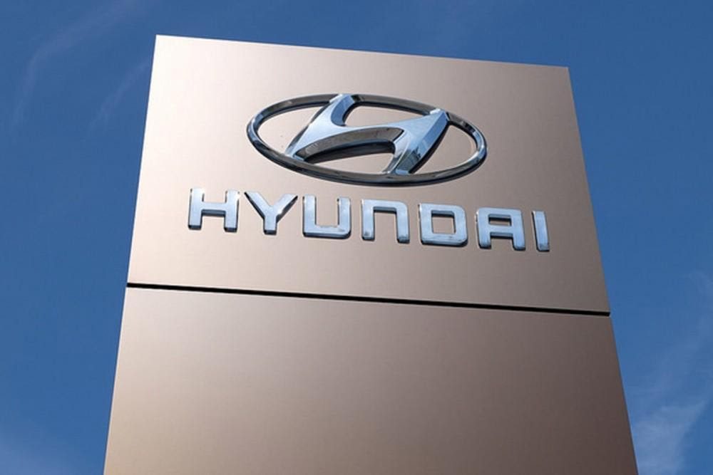
This symbol is more than just the letter ‘H’ for Hyundai. It’s actually the silhouette of two people shaking hands—one the consumer and the other a car dealer. This signifies satisfaction. Meanwhile, the oval stands for the global expansion that Hyundai aimed for during its inauguration.
Universal power button
The power button is something we see every day. It’s such a common symbol in the tech world that we don’t give it much thought as to what the symbol actually means. Well, the credit actually goes to the binary system for what this symbol means.
Everywhere in the world, a half-O and a stripe at its center mean the power button. The ‘O’ means that the device is off, while the stripe, resembling the number one, means the device is on. When placed together, the power button actually signifies a device on standby.
The king of hearts
The eight of diamonds isn’t the only suit with a hidden Easter egg. If you pay attention to the king of hearts and compared it to the other kings, you’ll notice that he’s the only one without a mustache. How come?
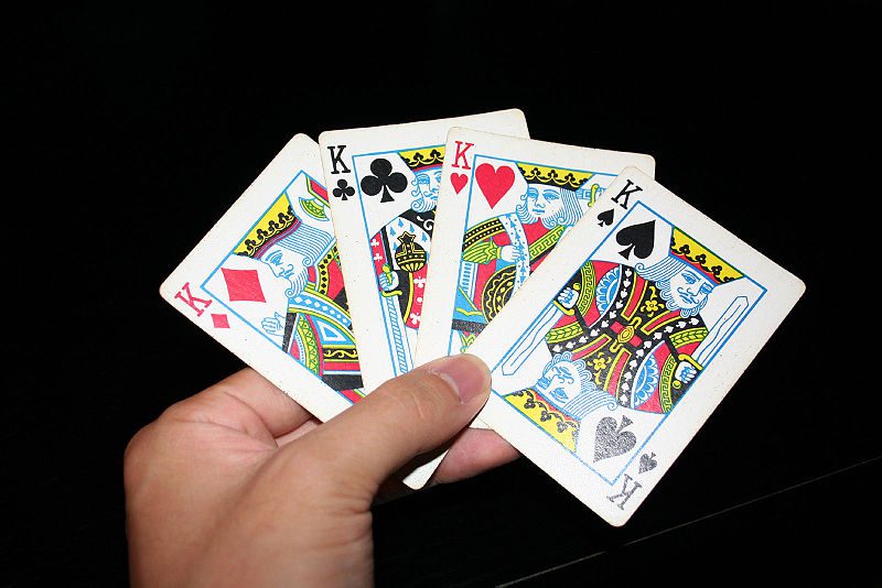
Before electronic printers, cards were printed using wooden blocks. Separate parts carried specific aspects of the design. The missing mustache is said to have been the fault of an unskilled worker who probably forgot to apply the block with the mustache. Funnily enough, this mistake was never fixed up to this day.
Apple
The world-renowned brand Apple settled on a logo which features a once-bitten apple. There are many stories as to how this logo came about. One of the most popular is when the designer Rob Yanov bought a bag of apples to inspire him.
A single apple would have been too basic. As he sketched and sketched, Yanov had an epiphany. The word “byte” – a group of binary digits that become their own unit – and the word “bite,” like biting an apple, sound the same!
US pennies
Coins and bills around the world feature national figures such as presidents, kings, queens, heroes, and martyrs. The pennies in the US are no different. They are embossed with the likeness of Abraham Lincoln. But have you ever wondered who crafted this image?
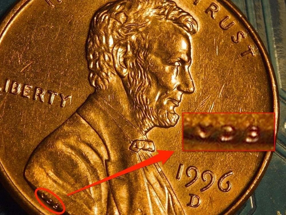
Much like paintings, which often have the artist’s signature and date of completion in a corner of the canvas, US pennies carry those credits as well. Victor David Brenner was the one who created the portrait of Lincoln, which ended up being on the coin. His initials V.D.B are on the lower left side of the coin, engraved forever.
Gillette
Many logo designers make it a point to incorporate the actual product into the logo itself. Gillette’s logo is no different. It may be too subtle for anyone to take note of, but once you see it, you’ll think, “Oh! That actually makes perfect sense!”
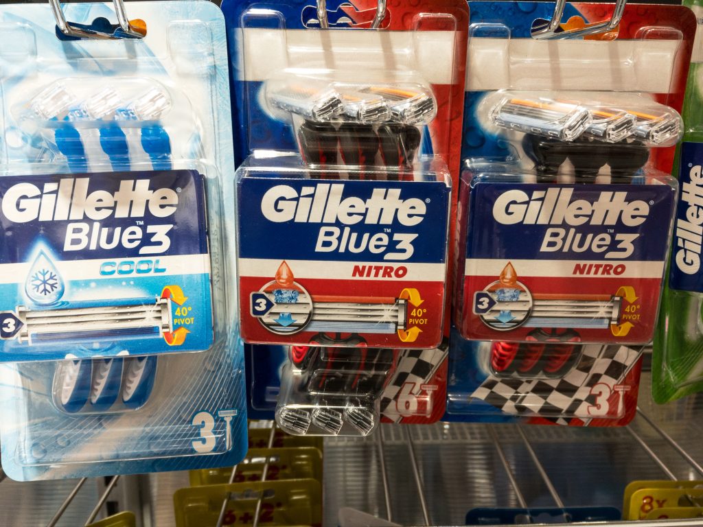
Gillette is known for their razors. Varying from three to six blades per razor, this results in a clean shave for both men and women. This clean shave is what is represented in the logo. As you can see, the letters ‘G’ and ‘I ‘look like they’ve been sliced with a razor!
Atlanta Falcons
The American football team, Atlanta Falcons has been around since 1965. Between then and now, they have had different iterations of logos, uniforms, and helmets. The most recent logo is the one we now see the players sporting every game.
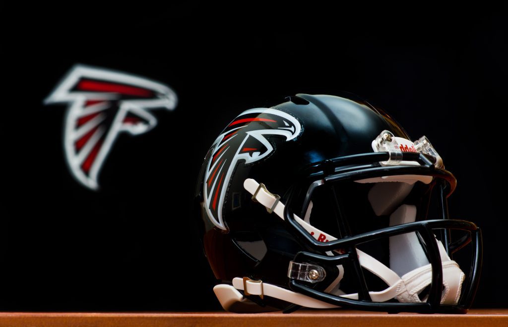
The logo not only features the falcon, but it’s also cleverly designed to form the letter “F” for falcon. Notice now the falcon is hunched over, creating the top stroke of the letter, and its talons create the lower stroke. Its wings drape down, creating the ‘F’s’ vertical stroke.
Toyota
Many guesses have been thrown as to what the Toyota logo actually means or signifies. It seems like a bunch of elliptical shapes intertwined together in a circle. Nothing about it seems to have anything to do with the name of the brand at all.
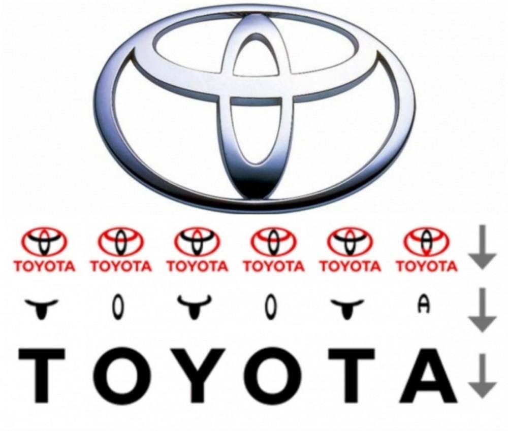
Those aren’t just a bunch of ovals overlapping each other. Every aspect of those shapes comes together to form the word “TOYOTA” – spelling the name of the brand in one swift, clean logo! How impressive is this? Now his is clever design!
Unilever
When it comes to design, nothing is ever random. The same can be said for the Unilever logo. From afar, it may seem like a bunch of squiggles and lines that form the letter ‘U.’ But if you look closer, you’ll actually notice 25 different images.
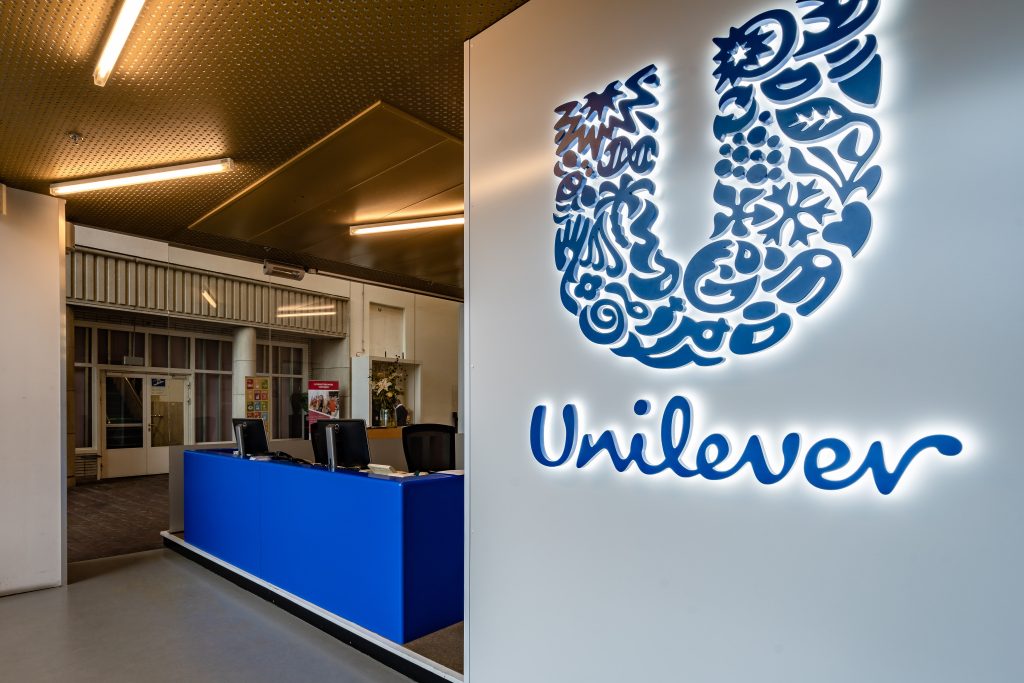
You can see a heart, leaves, palm trees, and a flower. There is also the recycling logo, a fish, and what looks to be a snowflake. Now that you notice this, you realize how intricate the design actually is. These images all signify the things Unilever stands for.
Wendy’s
Fast food chain Wendy’s has a logo that goes beyond just the little girl in the pigtails. You may think that the red-haired girl is all there is to the iconic sign, but pay closer attention to her shirt collar, and you will recognize a familiar word.
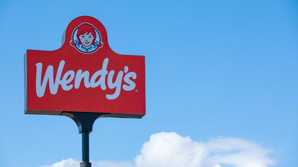
That’s right, her collar spells out the word “mom.” This is to signify that every meal is made with care, the same way a mother prepares a meal for her children. Of course, this tale was created by customers, but it’s still an adorable thought.
Pepsi
The soft drink competition in the United States was very strong when Pepsi hit the scene. The logo was revealed during World War II. Its red, white, and blue colors were meant to pay homage to the colors of the American flag and symbolize pride in the US.
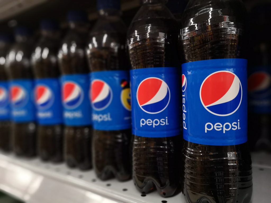
But why the circular logo? Apparently, it signifies the expansion of the universe, using Pythagoras’s geodynamics and the theory of relativity. We’re lost on these matters, but essentially, it’s aimed to pull customers towards the bottles, if you catch our drift.
Barber poles
Today, barbershops are associated with men’s grooming. But in the Middle Ages, haircuts and shaves weren’t the only things people came to barbers for. At one point in history, barbers were able to carry out medical procedures, even bloodletting. Scary, huh?
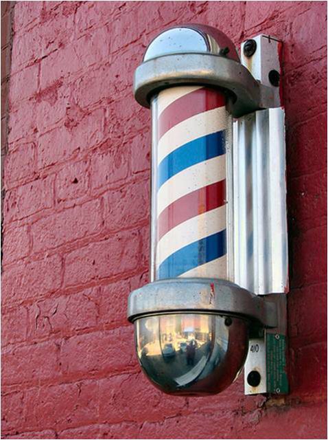
The poles we now see outside their shops are originally only red and white to represent the services available. Red symbolizes blood, and white symbolizes the bandages. In America, there is an added blue stripe. Some believe this was to show patriotism, as together they are the same colors as the flag.
Goodwill
In many parts of the world, thrift stores are the only places people will shop. Instead of shopping for new clothes or appliances in official stores, people visit thrift stores. This is not only a money-saving move, it’s often the only way many people can afford to buy things.
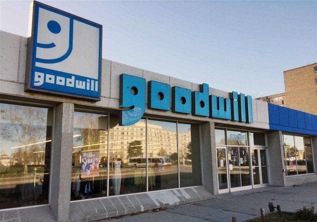
The logo for the thrift store Goodwill features half of a smiley face because the company believes helping others brings joy. And they definitely walk the walk. If you notice the letter “g” in the brand name, it’s the same half-smiling face as the logo!
The Statue of Liberty’s crown
The Statue of Liberty has been standing tall in New York Harbor since 1886 when France gifted her to the United States to mark 100 years of independence. The statue has since been a symbol of pride. But do you know some of the fun facts behind it?
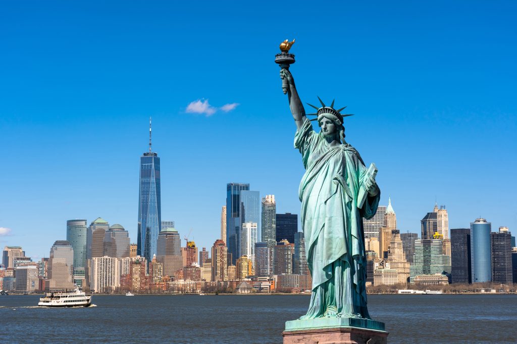
You may notice the unusual crown on Lady Liberty’s head. It spikes outwards, and there are seven spikes overall. Each of these spikes is said to represent the seven continents of the world. That’s one way to symbolize world dominion!
Jeep footrest
Jeeps are one of the most enviable, sought-after cars out there. Originally known for their four-wheel drive and off-road capabilities, they have now become a symbol of status and even a fashion statement for some. It’s cool to own a Jeep.
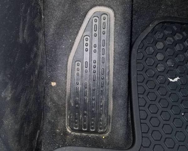
This time, we’re not paying attention to the Jeep logo. Instead, we’re checking out the footrest, which apparently has Morse code on it. Many have noticed this over the years. As it turns out, the code reads, “sand, snow, rivers, and rock.” Maybe this is to signify that the Jeep can drive through any of these elements.
Fuel gauge
Owning a car is a big responsibility. A lot of care goes into maintaining the car’s health, from making sure there’s enough fuel in the tank to getting it routinely serviced. It’s not just about driving in the sunshine with the windows down and your music playing.
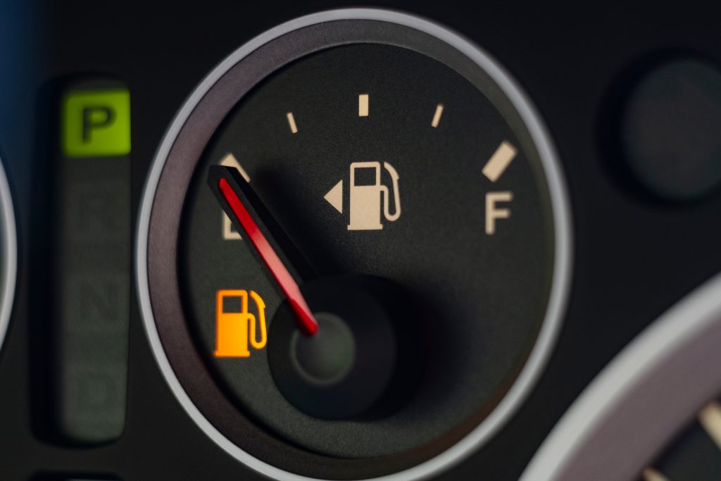
Some cars are designed differently. Some of them have the filler cap on the right side, while others on the left. If you’re a new driver at the gas station wondering which side the cap is on, all you have to do is look at the fuel gauge. The arrow next to it points to where the cap is.
BMW
The BMW logo we know today is blue and white and is believed to be designed to resemble a checker’s wheel. However, as it turns out, this long-standing view is a myth. Since the brand’s founding in 1916, there’s really no explaining where this logo comes from.
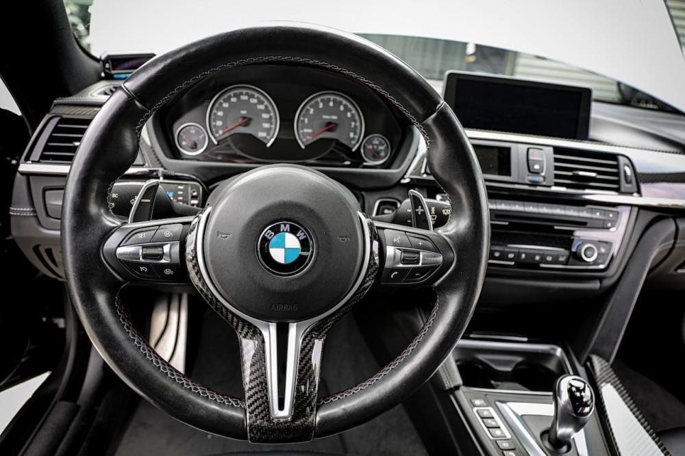
Many have speculated on the background and origins of the logo. Some are of the mind that the colors blue and white are meant to pay homage to the state of Bavaria, where the company was first founded. But is this true? We don’t know for sure!
Sony VAIO
In an oversaturated market, new products have to work twice as hard to stand out. Not only do they have to offer more than the competitors, they also have to visually attract potential consumers. A well-designed logo is a way to do this.

When the Sony VAIO laptops came out in the early 2010s, they not only drew people in with their variety of pretty colors. The logo was also notable. The VA is an analog symbol, while the IO means digital. This perfectly represents the product and the brand.
USB
Despite most technology moving to cloud-based systems these days, USBs are still used for one reason or another. Whether it’s to charge devices, connect external hard drives, or move files, we use it almost daily, and we’re all familiar with the USB symbol.
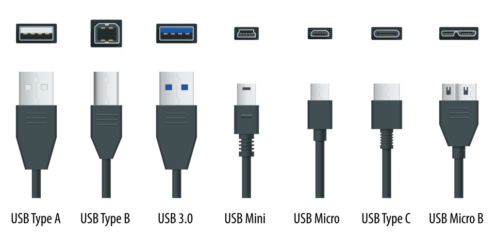
Fun fact: the USB sign was inspired by Neptune’s trident. The three-pronged sign symbolizes power, but its details also symbolize other functions of the device. The arrow signifies data, the square signifies ground voltage, and the circle stands for five voltages.
Paramount Pictures
Moviegoers and avid movie watchers will be familiar with the Paramount Pictures bumper that plays before most movies. The studio has produced award-winning movies for decades, under the logo which had 24 stars. They each represented an actor signed under their management.
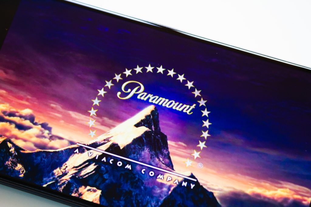
Paramount changed its logo in the 1970s, and instead of 24 stars, there were only 22. Nobody knows what happened to the other two or where they went. This might just be a design thing, though. Maybe somebody thought 24 stars were two too many.
Stardust Casino
The Stardust Casino opened in the 1950s. It lived a long and glorious life, hosting many visitors throughout the years. It became known for its iconic logo, which featured a cosmic explosion. There’s actually an intriguing story behind this logo.
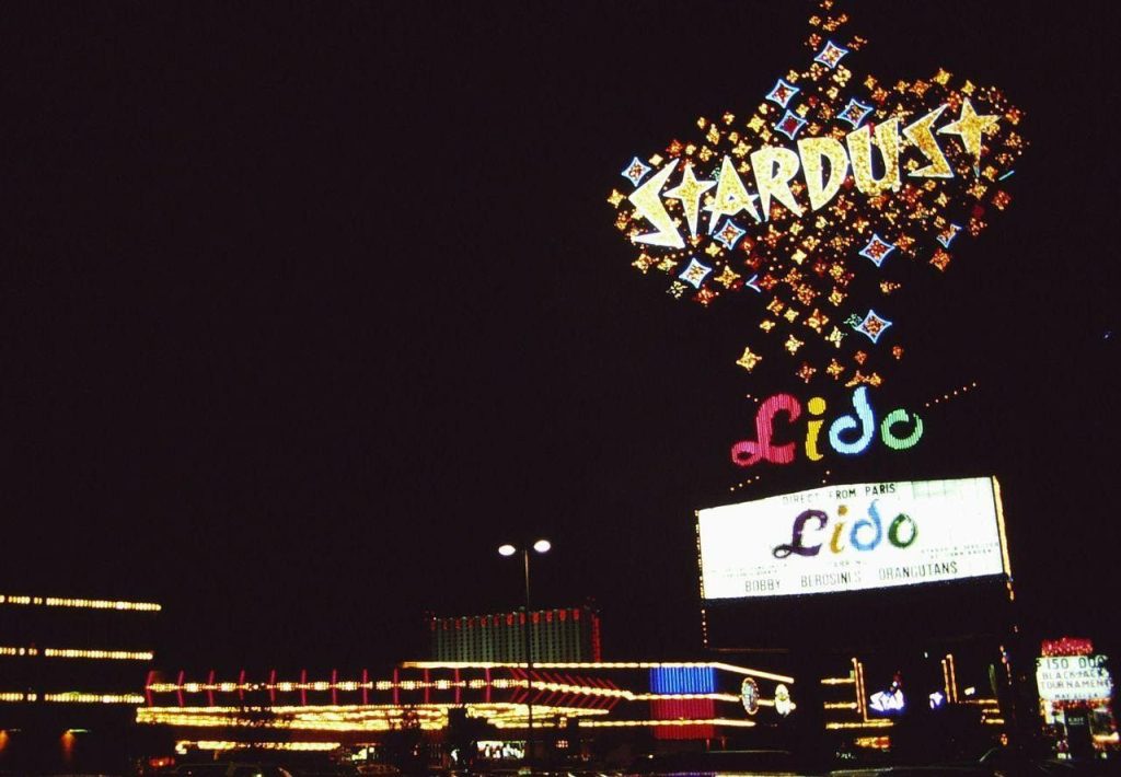
The casino was actually built on the Nevada Test Site, established in the 1950’s for the purpose of testing nuclear weapons in open spaces. Those who lived in that area would be used to seeing mushroom-like clouds from the explosions. That’s why the casino’s logo is like an explosion.