Parallel Realms: The Enchanting World Of Robin Vandenabeele’s Double Exposure Photography
Robin Vandenabeele is a well-traveled photographer who takes the most gorgeous landscape photos you’ve ever seen. By introducing the double exposure technique into his work, he has made a name for himself as a standout photographer in his industry. From weird, dreamlike cityscapes to serene vistas of wide open spaces, each shot takes the familiar and twists it into something new.
From Las Vegas to Stockholm, this photographer’s kaleidoscopic lens captures each scene with a vividness and vibrancy that adds clarity to the surrealism on display. We guarantee that you are going to love this mind-blowing collection of weird yet magnificent images. Sit back, relax, and strap yourself in for a collection of photographs that will make you gasp in amazement.
Auckland #02
Our first image features the city of Auckland and its vast array of railway tracks. We thought it was the perfect introduction to the kind of unique images this talented photographer creates, thanks to his brilliant expertise and signature double-exposure technique.
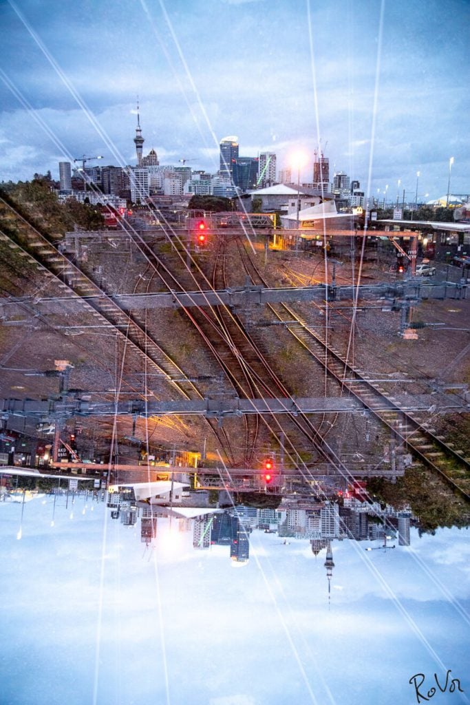
The flipped image is always visually intriguing, and that sense is increased by the fact that the subject matter is simple yet equally interesting. The different elements in this picture come together quite nicely to create a masterpiece worth hanging on a wall.
USA Roadtrip #16
In this one, the photographer has moved away from urban scenes and applied his methods to an open vista of natural terrain. We like the way the ground is sandwiched between two slices of sky. The cloud patterns are the cherry on top.
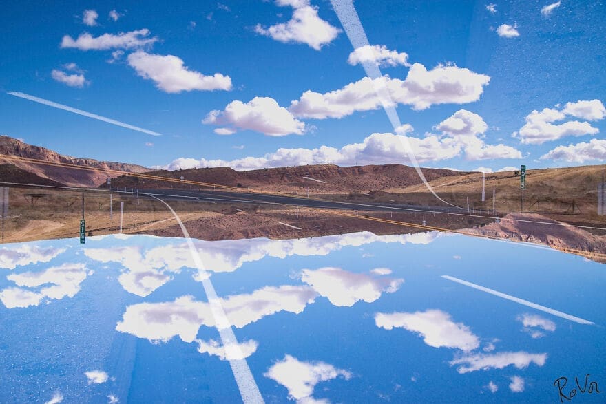
Even without the photographer’s unique editing, you can tell that this is quite the location. It looks more like a collage than it does a photograph and provides an excellent example of what can be achieved with a bit of clever camera trickery. It must take a lot of creativity to come up with these.
Milano #33
This one is as stunning as it is surreal and weird-looking. The image is crosshatched with camera trace, adding a sense of depth and another element of interest to the piece. We can’t get over how the artist makes awesome photos out of seemingly simple shots.
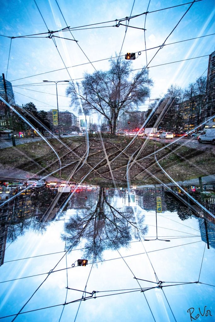
It seems that once the photographer discovered this camera technique, he just ran with it. Experimentation is a crucial step in any creative endeavor, and when it leads to results like this, it is definitely a worthwhile process, wouldn’t you agree?
Bruges #405
With the bridge as its focal point, this photograph conjures up thoughts of paintings by the famous Monet. The soft textures and gentle color palette lend the image a dream-like quality more akin to a watercolor painting than photography. It is seemingly demure but also quite attention-grabbing.
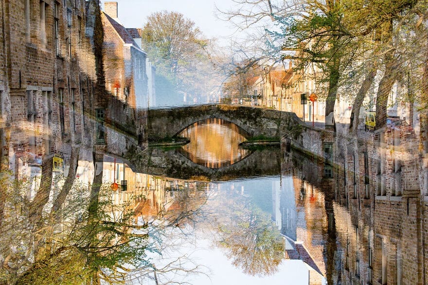
The water in the river provides a natural reflection which is then emphasized and played upon by the mirror image that is produced by the upside-down double exposure technique. We particularly like the way the bridge seems to stretch out and become part of the building. You can tell it was done very intentionally.
Bruges #493
What stands out most in this picture is the ‘wrap-around’ effect over the tree on the right side of the frame. It looks like it has been wrapped in polythene. Vandenabeele’s editing on this one adds a sense of artificiality to the picture that is quite effective and eye-catching.
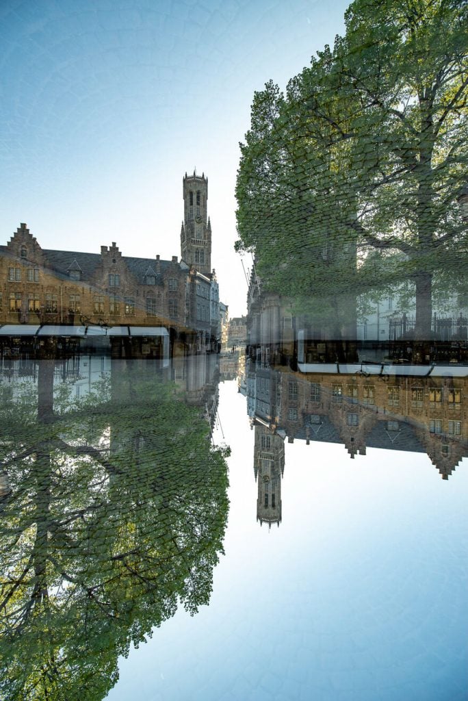
The way the reflection seems to pool, expanding outward from the middle, makes it look like the street has been flooded. It’s a fascinating effect and transforms the whole feel of the picture. We bet if we saw the original, we would appreciate this even more.
White Sands #31
This is one of our photographer’s more abstract pieces. We think it would be a stunning piece to hang on a living room wall. Unlike most of his other work, there is no hyper-detailed focal point, just the undulating waves of the rolling sands. The double exposure is also not as obvious here.
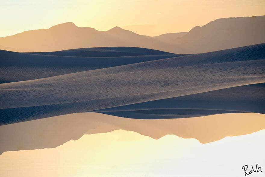
There is a real sense of stillness and calm in this image. The negative space frames the image in a really lovely way. Something about it just calls to you. It’s impressive how the photographer is able to produce these strange and evocative images so consistently.
Stockholm #96
In this one, the central image has been reduced and stripped down of any cohesion, and the strange cutout effect is emphasized by the stark white of the background. There is an almost sinister quality about how he chose to take and edit this particular photo.
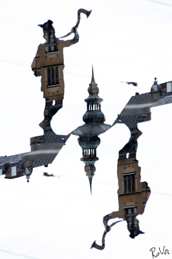
Shape is a crucial tool that is used to achieve various effects. In this photo, the form of the structure has been stripped away to leave a mere suggestion of what was originally there. It’s a bit different and very mysterious. Well, we like to think that experimentation is a big part of art, so…
Paris #73
We absolutely love this one! The subject is the famous and neon-drenched Moulin Rouge cabaret venue in Paris, and the sense of life and movement in this photo comes across very vividly. It’s a riot of color and light, which we’d say is quite fitting for the City of Lights!
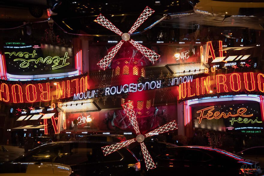
There’s a feeling of movement that permeates through the image. The Moulin Rouge is a famously risque cabaret in Paris, and the fractures and strange twists in this photo really capture that sense of zest and chaos. It takes real talent to capture all that in a single snap.
Paris #55
This next one is a nice contrast from the Moulin Rouge picture as it depicts a completely different side of Paris. The stillness and calm is almost palpable in the photo. It looks cold and peaceful, and the sky compliments the river perfectly.
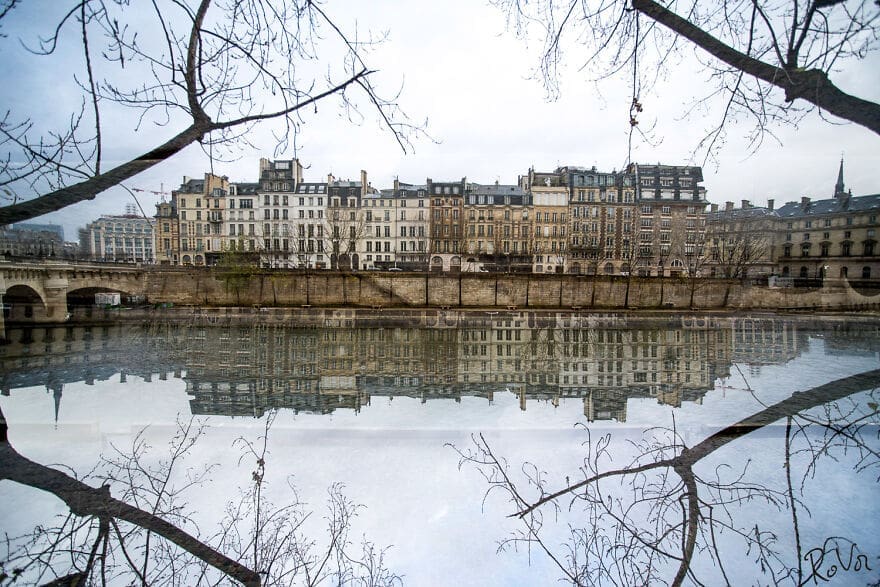
The washed-out feeling in the picture just makes you think of old movies set in Europe. The branches that frame it help to hold it together as a cohesive whole and lend it a defined sense of structure. We wonder if he took this and the Moulin Rouge pic during the same visit.
Neon Boneyard #29
What is going on here? It seems our photographer took an image and completely transformed it into a piece of surrealistic abstract art. He picked out key elements of the image and washed out the rest of it, and this was the final result.
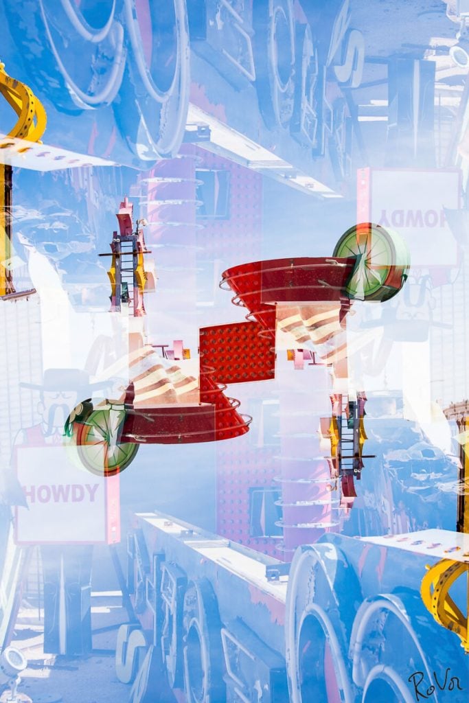
There is something robotic about the shapes that have been emphasized. The pic is also slightly disconcerting in the way that the structures seem to be just appearing out of the misty, washed-out background. Once again, we are simply blown away by the pieces Vandenabeele creates.
Miami, Ocean Drive Hotel #23
This one is all about the angles and the light. There is something here that really captures the entrancing bright lights that you associate with the city of Miami. The photo is almost painterly in its texture, feeling, and crazy perspective. It’s definitely something we would purchase for ourselves or a loved one.
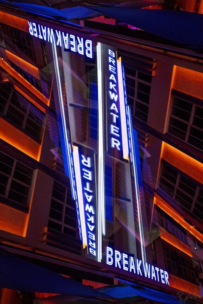
The building seems to be tumbling into itself. This style gives off a sense of kinetic energy that is not usually inherent in a photograph of a building. It’s certainly one of the photos that goes to show this photographer’s ability and imagination and his unique style.
Miami, Ocean Drive Hotel #15
This one is a bit more restrained and maintains a quiet sense of elegance. It’s a simple but effective use of double exposing a photograph. The subject matter of a neon sign is elevated by its reversal, and the clean lines add to the effect. The concept of ‘less is more’ is clear in this piece.
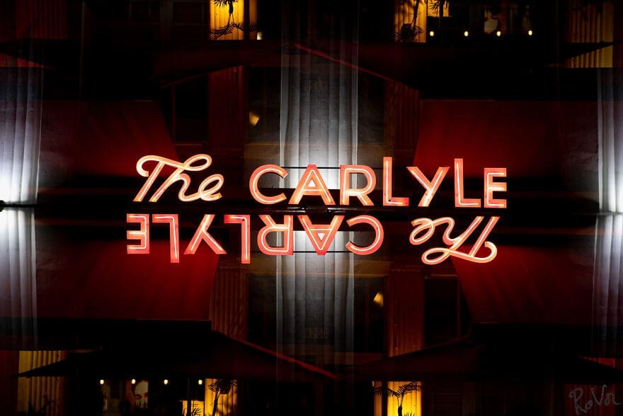
The other thing we think you should pay attention to with this one is the depth of background achieved by the shade and reflection captured in the snap. This is heightened by the flashes of light that appear in the middle and sides to make a fantastic picture.
Bruges #108
Our next picture is all about the distressed look of the building. It almost looks like somebody actually made physical marks on the surface of the photograph. Additionally, it has a sort of punk quality to it that transforms it from a regular street scene.
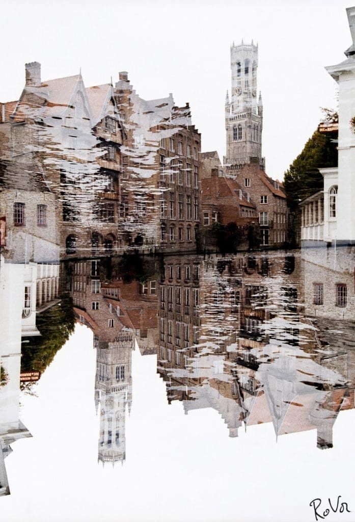
There is a strong feeling of coldness that permeates through this image. Thanks to the obvious color palette, this photo comes off as extremely emotive. We would have loved to know the thought process that went through his head when he took and edited this image. Whatever his goal was, we suspect he nailed it!
Barcelona #45
There is a clear diagonal throughline in this image. The main strip is a facade of an apartment block. Yes, we know. It was hard for us to believe it at first, too! This is nicely echoed and reinforced by the sections of green foliage that make up the outer thirds of the image.
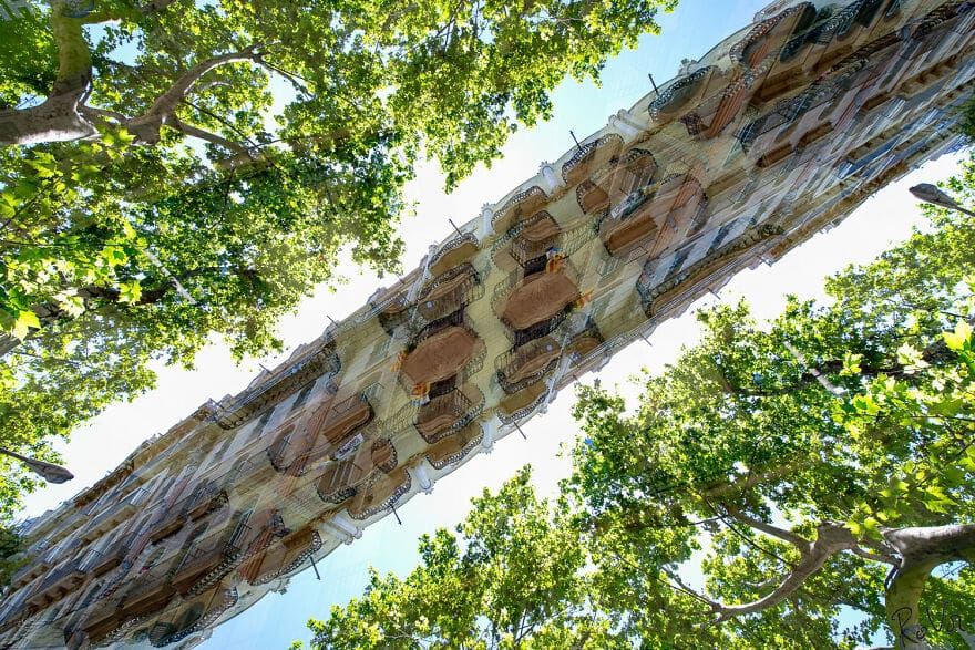
The synergy of shape on display in this picture is what it is all about. A closer look reveals the detailing of the tree branches, which provide a further point of interest and juxtapose nicely against the straighter lines. Quite unique indeed.
Btuhes #514
As far as street scenes go, this is one of the more unusual ones that we have seen. The whole place looks like it is floating in a clear azure sky. It makes us think of a mythical kingdom somewhere between a dream and reality.
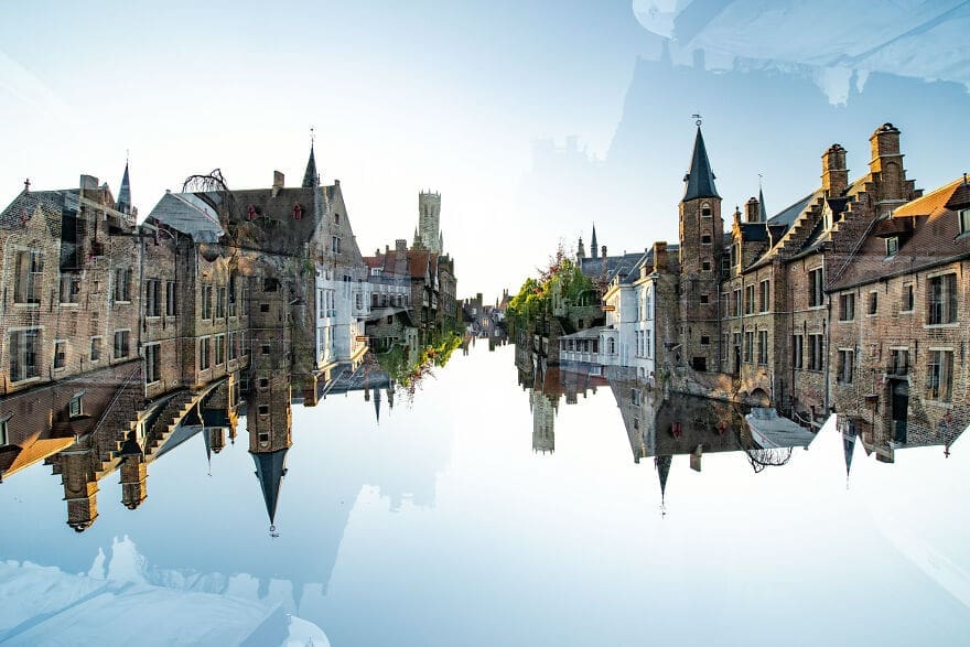
These dream-like photographs work so well because they present things that are at once familiar but are oddly distorted and changed to subvert our expectations. The more you look at them, the more remarkable they become. If that isn’t the collect thing, we don’t know what is.
Vienna #38
The central tower photographed here provides a pillar from which the rest of the image rotates around. We really like the yellow blossoms patterned over the building and those around it. We’d say they do an excellent job of adding a sense of texture and interest to the picture.
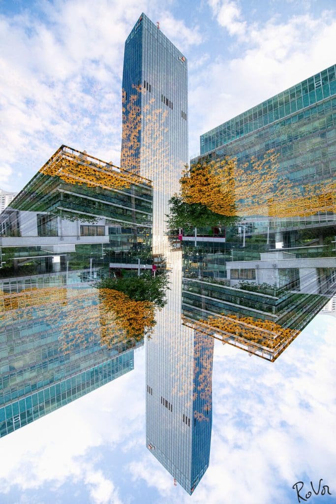
Interestingly it is the sky, so often depicted as a constantly changing entity, that acts as a static point of reference in this example. We are not quite sure how this effect works; maybe it’s a trick of the mind, but it’s really awesome. Mastering it must be quite the skill.
Vienna #15
The way this building is depicted in this image is reminiscent of a sort of weird, angular staircase. Like other photographs in this list, we are reminded of the work of M C Escher in the way the angles play together.
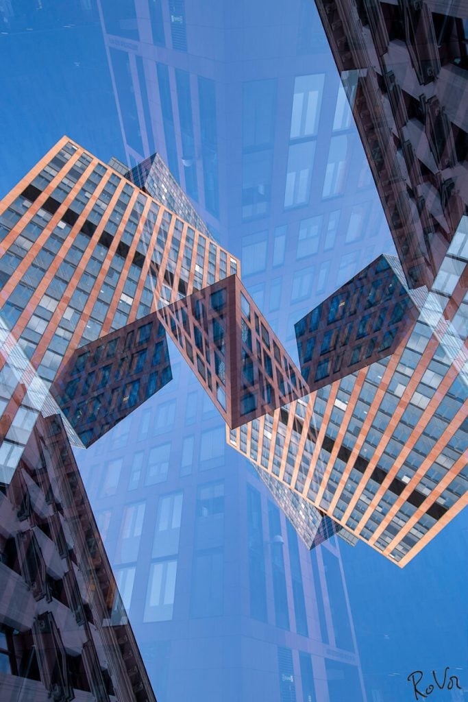
Graphic design has obviously been a big influence on the style of these photographs. The light and shade, angles, and rhythms of the piece all combine to form an image that is both playful and mundane in its subject matter.
USA Roadtrip #51
The desert is one of those locations that is always ripe for photographic potential. The wide-open vistas and interesting textures are ideal subject matter, and in this example, we can see them being used to maximum effect. The results are undoubtedly spectacular.
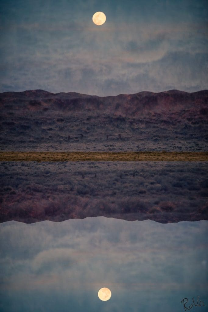
This piece may lack the visceral qualities of the photographer’s urban set work, but it retains a serene sense of eerie calm typical with a number of his other photos. That said, it’s the texture captured within the frame that really catches our imagination in this one, not to mention the harmony of color.
San Francisco Financial District #51
By taking a subject, be it a landmark or a building, and stripping it from its context – letting it just float within the frame of the photo – this talented and unusual photographer is able to impart it with new meaning. That’s very clear in our next item.
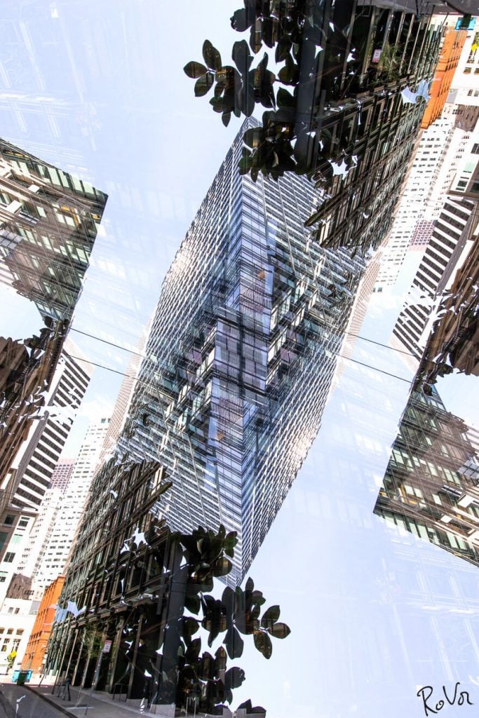
If art can be defined as something that provokes a reaction in the viewer, then the photographs collated into this list surely qualify. There is something ethereal and otherworldly in the way Vandenabeele puts everything together, and we can’t get enough.
Paris #44
It’s one of the most recognizable landmarks in the world. As such, it is no surprise that the photographer would opt to make the Eiffel Tower the subject of one of his series of double-exposure photographs. We have to admit though, we have never seen the tower photographed like this before.
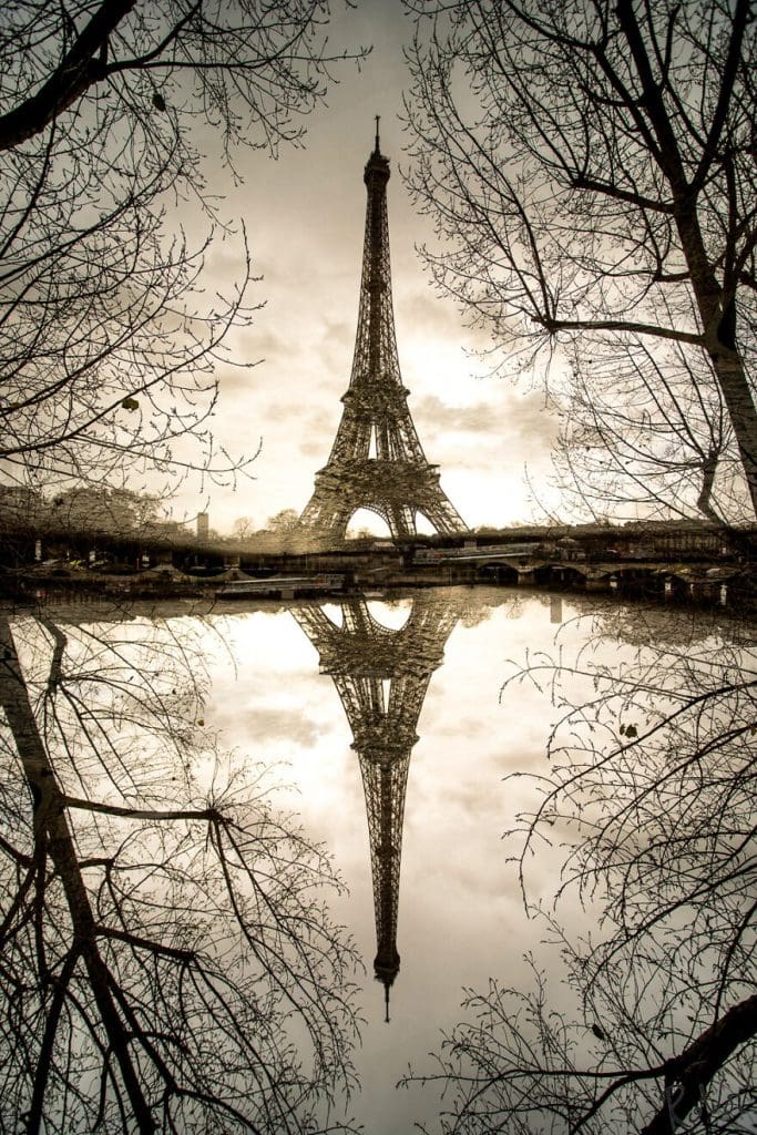
This is a mean and moody representation of the iconic landmark with washed-out tones that give a very wintery feel to the photograph. Once again, the use of tree branches to frame the shot adds a sense of depth and interest. This photographer seems to have a penchant for that style as well.
Berlin #48
This twisting image is a perfect illustration of the unusual effects that can be rendered by using the double-exposure technique. There is a definite point of focus in the center of the image that everything else seems to revolve around. Can you find it?
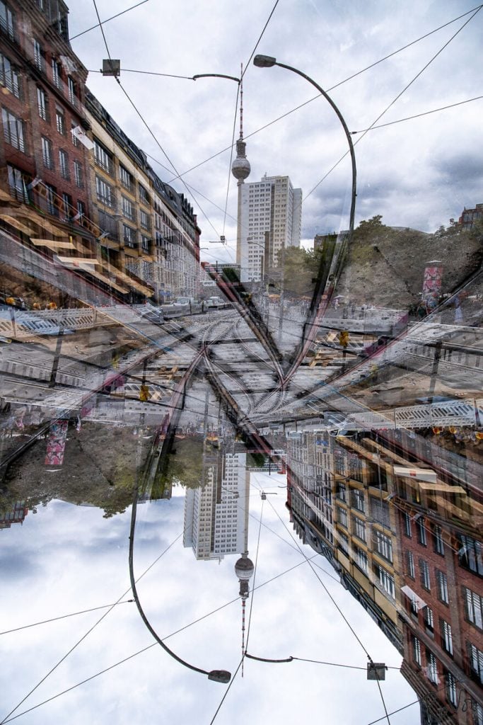
There is a certain bleakness to this one that is hard to define but nonetheless sets the tone for the whole picture. It’s a bit like a dream within a dream within a photograph. Perhaps the allure of surrealism is that it allows us to see the world the way it really is.
San Francisco #19
Next up, we have another photo that is very much a kaleidoscopic interpretation of its subject matter. What really stands out in this image is the shards of light that seem to be coming from the windows of the building.
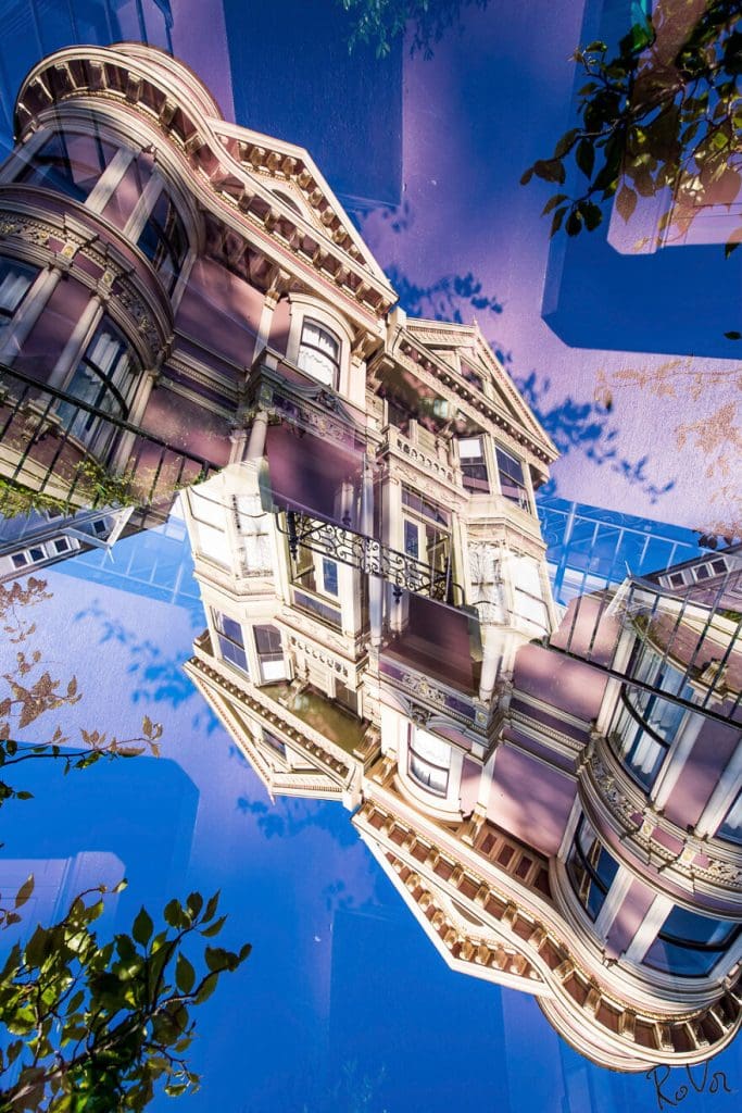
The building is removed from its natural environment, and it is this absence of context that lends the photograph such a surreal vibe. Abstraction is a useful tool for work of this nature, and this photographer certainly knows how to use it.
Milano #65
It’s the reflection of the zebra crossing that really catches the eye in this picture. The way it strips across the bright blue sky gives the impression of placing this exterior shot into an enclosed space. Kind of like moving the outdoors indoors.
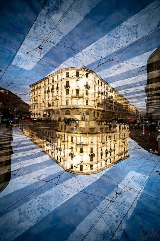
The building, the street, and the central subject matter were all picked perfectly, and the effect used adds a weird sense of confinement to the piece. Furthermore, the clarity of the reflection is incredibly detailed and gives an effect similar to the ‘infinity effect’ produced when two mirrors face each other. Very clever.
Golden Gate #32
As perhaps the most iconic bridge in the world, it is no surprise that this talented and unusual artist eventually chose to make the Golden Gate Bridge the subject of his work. The urban sprawl of San Francisco appears to us through the bridge’s support system.
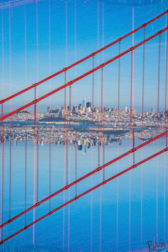
Such is the striking nature of this photograph. The fact that there is a mirror image of the city underneath the real one doesn’t seem to be shocking or unusual after all the snaps we have seen from this guy so far. That just speaks to his talent and expertise.
Ghent #217
This is one of the ‘moodier’ images in this list. It is certainly a feat of technical camerawork, but the overriding sense is gothic dread that is multiplied by the fact that everything is reflected so clearly. We could totally see this as a scene in a phenomenal film.
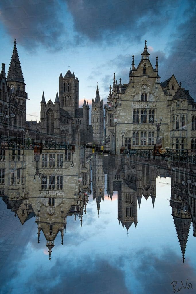
It’s such a well-defined image that you can almost feel the cold and the dampness just by looking at it. Like most others on our list, it is a marvelously evocative photograph that’s a great demonstration of the photographer’s range and ability with a camera.
Bruges #492
This mirrored image of a castle is given a natural border by the green foliage of the trees, making it a very effective composition. There is a certain fairytale-type of quality to this image that conjures up connotations of princesses and dragons.
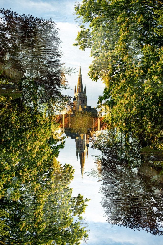
The geometric shapes that combine to make up the form of the castle give it a very strong sense of graphic design. The central subject almost looks like it has transformed from an actual building and become a representation of one instead.
Stockholm #33
How trippy is this one?! It looks like the buildings in the photograph are tessellating with each other. This is one of the more incredible photographs on this list, as it is an excellent example of this photographer’s creativity and abilities.
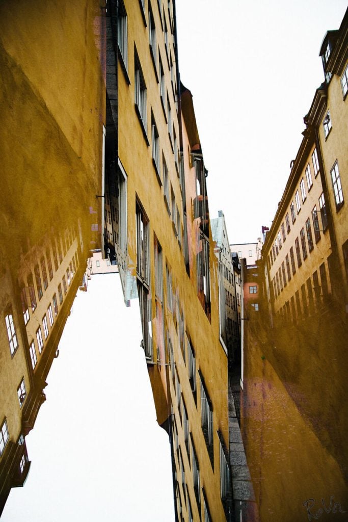
We think that after seeing all the brilliant and intriguing photos we have featured, it is going to make normal photos seem rather boring by comparison. Well, we’d say it’s a worthwhile endeavor. The range of effects that a simple double exposure can produce is amazing.
San Francisco Hayden Street
It’s the scrambling of perspective in this image that really blows our minds. This is a stunning photo that looks like it could be a scene straight out of Alice in Wonderland. Like most popular pieces of art, it’s bizarre and beautiful at the same time.
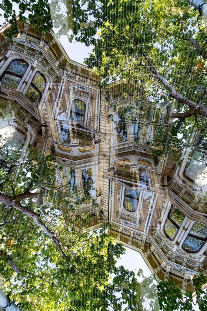
Everything seems to be joined and altered, and although the effect is highly disorienting, it’s a bit like one of those magic eye pictures, and the more you look at it, the more details and hidden elements you can see. Try and look at it a little longer.
Grand Palais #16
There is something in this image that reminds us of the interior of some futuristic machine. Its clean lines and intricate combinations of shape and structure all work together in perfect harmony. The shadows almost seem to be in a liquid state in this image.
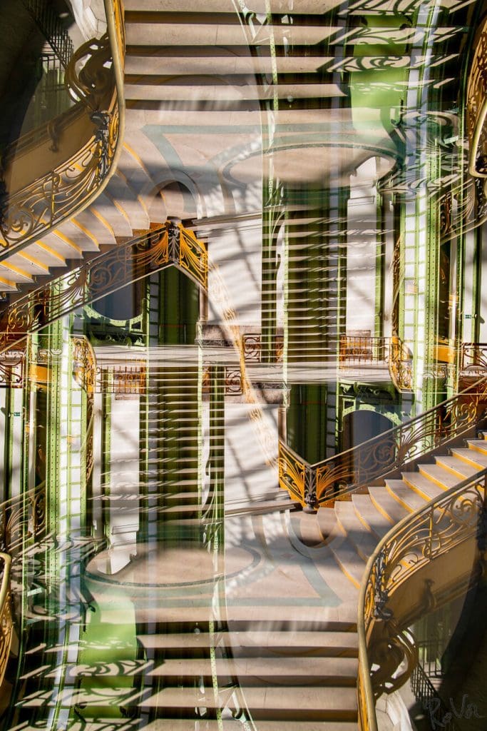
It’s like something out of a dream, a vision, or a weird hallucination. The effect and colors are quite simply stunning. Actually, we think this one has to be our favorite! It’s just such a pleasing image to loom out. Beautiful work.
Neon Boneyard #23
This twisting accumulation of different elements of neon signs that have all been strung together to produce this snap is a bit different from the previous photographs we have seen. There is no discernable scene as such. We just have elements combined into something abstract.
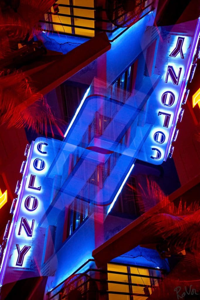
To be able to achieve this effect through a simple double exposure demonstrates this artist’s incredible sense of vision. The ability to produce this kind of work is a testament to his staggering technical ability. Vandenabeele is a magician with a camera.
Bruges #420
We just love the detail of the building’s facade that is captured in this almost high-definition photograph. The sharpness and clarity of the image almost seem to make it feel more like a graphic drawing rather than a photograph. As with his other pics, the more you look at it, the more impressive it becomes.
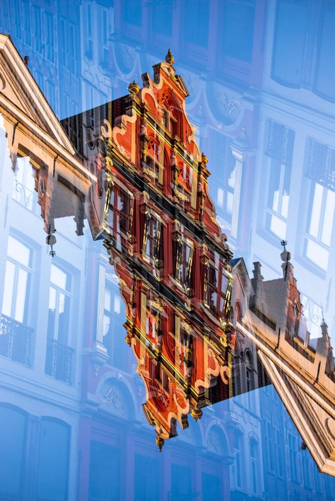
The building is kind of reflected onto itself, which gives the effect of a ghost building existing completely separate from the hyper-real, original subject of the photograph. It’s a subtle variation but one that works so well, according to us.
Golden Gate #27
This is quite simply a stunning photograph. We have seen other versions of the Golden Gate Bridge in this series, but we think this one is our favorite. The bridge is foregrounded against a washed-out mass of land behind it.
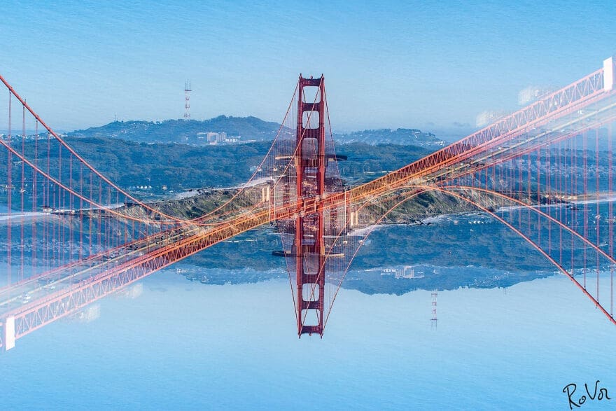
The way these two elements juxtapose with one another gives this picture a real sense of form and clarity of vision. It is so refreshing to see such an iconic and well-known landmark shown in a fresh and original way.
San Francisco, Powell Street #02
There is a sense of melancholy that permeates through this photo. Perhaps it’s the muted colors that all seem to blend and merge with each other before dissipating to nothing at the vanishing point. The reflection of the sky below makes it look like the street is floating on water.
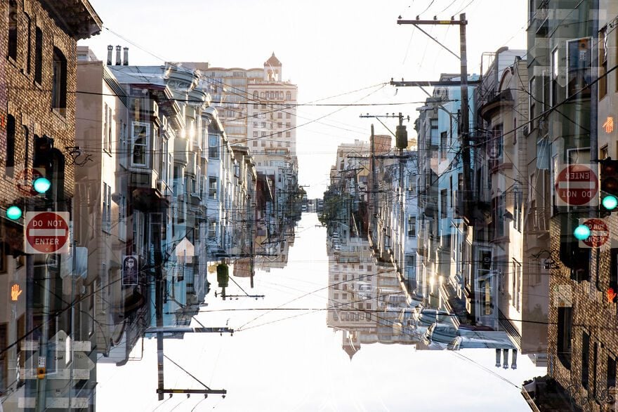
Additionally, the double exposure that causes the reflection is almost an afterthought in this photo, but it fits naturally within the frame of the piece. It certainly adds so much to the final result but doesn’t overpower it. It’s all in the balance.
Berlin #13
In life, it’s often the simplest things that are most effective and work the best. Photographs like these make us glad we believe in that rule of life. The geometric cross shape formed by the buildings is the focus point, and the rest of the photo takes its cue from that.
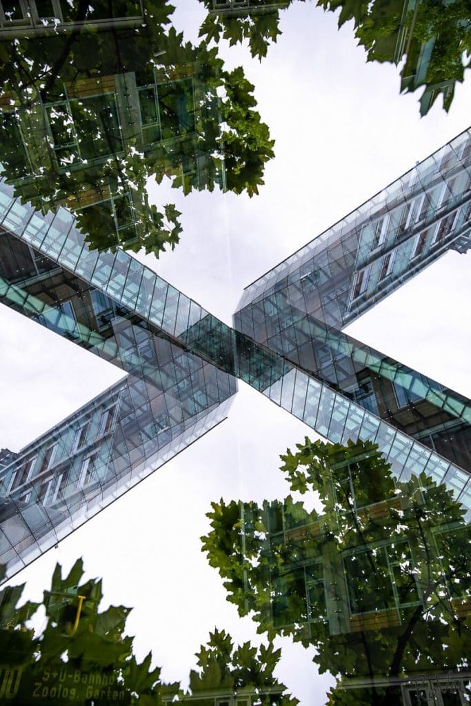
This pattern is echoed and superior-imposed upon the leaves of the tree that appear at the top and bottom. Furthermore, we really like the effect of the regular straight lines appearing over the natural irregularities of the leaves and trees.
USA Roadtrip #25
The textures in the clouds are what really make this picture the masterpiece it is. There’s something very exciting about a road trip across America. Though it’s something we are familiar with through movies and television, not many people have actually done it.
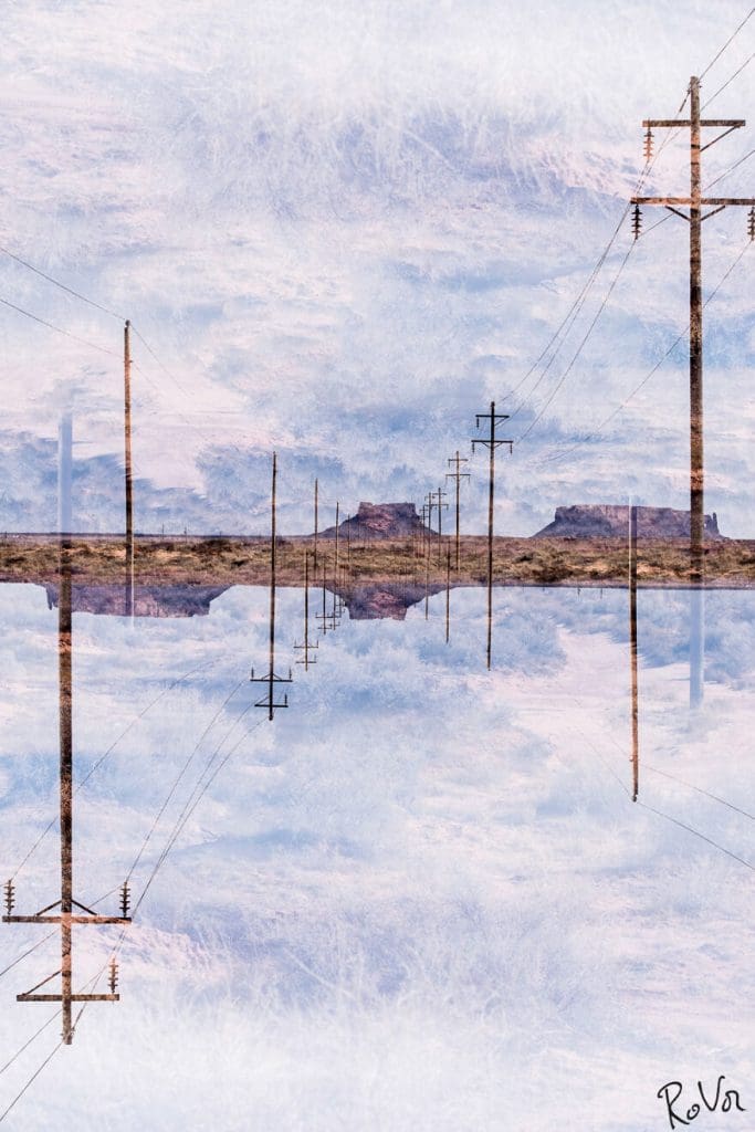
Somehow this photograph manages to conjure up all the emotions that we associate with this particular type of trip. The wide open spaces and big skies all speak to a certain type of unrestricted freedom. It’s adventure and infinite memories that you know you’ll keep forever. Time to hit the road!
Milano #71
This photographer often makes use of sparse backgrounds to make the central image really stand out. This photo is an excellent illustration of that. This style serves to highlight the shapes and forms of the building featured as the subject.
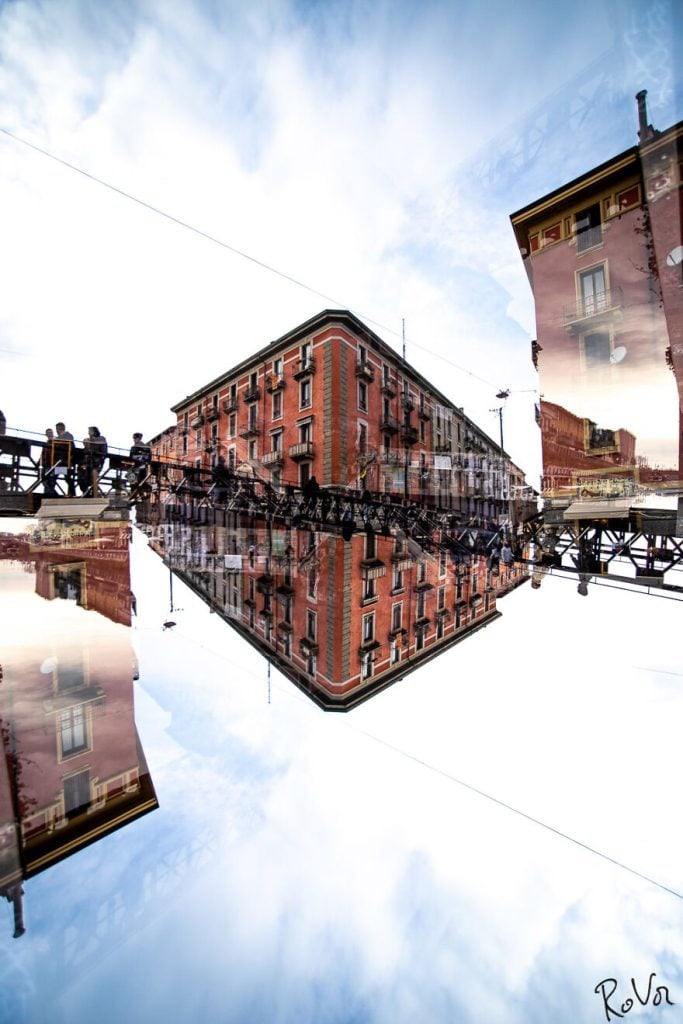
This is quite an unusual one in other ways because it depicts people walking across a bridge towards the viewer. Due to the nature of the photography, we are unable to make out much detail which adds to the dreamy surreal atmosphere.
San Francisco, Painted Ladies #06
The shifting perspectives that can be identified within the frame all seem to complement and play into the structure of the others. The dappled sunlight that radiates throughout the image is another part of the picture that adds to the effect.
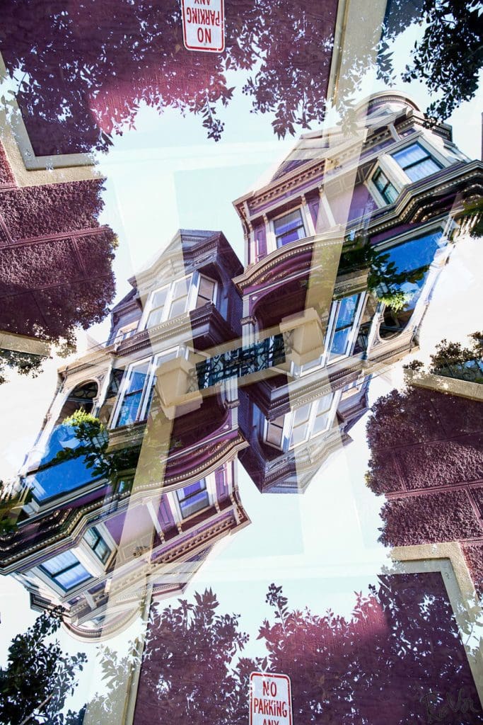
We like the way the leaves of the tree are depicted in differing textures. This adds further interest to what is already a very intriguing picture. The ‘No Parking’ sign almost seems to take on a deeper meaning when shorn of context.
Copenhagen #21
How many windows can you count in this photograph? There are windows within windows and walls on top of walls. It’s evident that this photo was deliberately built up in layers. As we have seen in several others, this adds depth to the image and adds to the aesthetic quality.
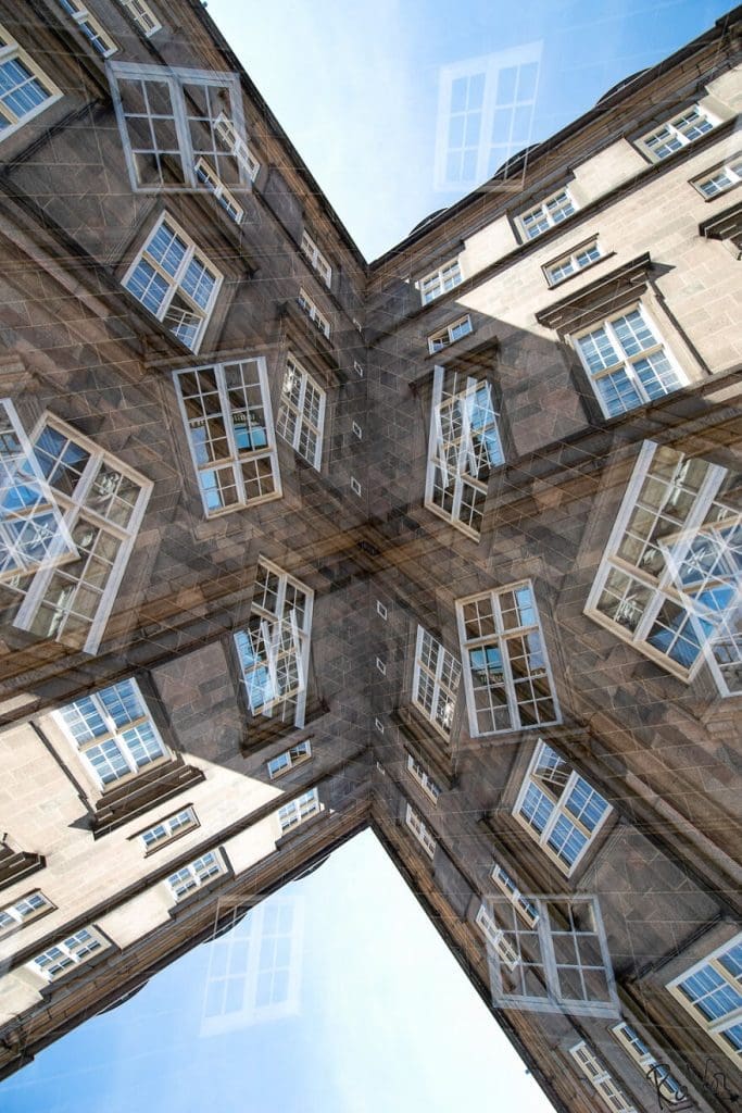
We love the way that what would have ordinarily been a generic photograph of a building has been completely transformed into something that is both vibrant and weird. Without his touch, you wouldn’t glance at it twice. The more we see this guy’s work, the more we like it!
Las Vegas #3
Vegas is the kind of city that is a perfect fit for this photographer’s unique sense of image and form. In our next entry, Vandenabeele chose a statue in a water feature as their central focal point making the water ripples dissipate into the rest of the photo.
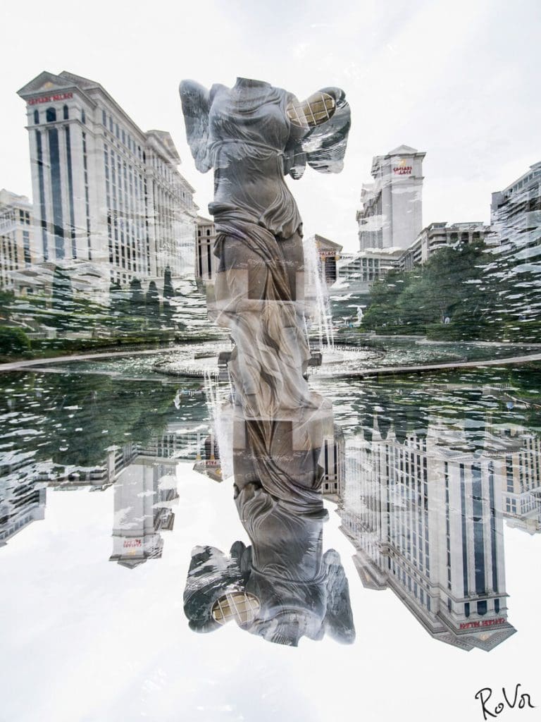
It’s interesting that when we think of Las Vegas, we tend to picture a neon-drenched city of lights. But here, the photographer has captured a calmer, more serene side of Vegas that gives the photo an added sense of nuance. We think this perspective adds to the allure of this beloved city.
Bruges #498
The brickwork pattern shown with the horizontal stripe of this building that traverses across this image reminds us of a section of honeycomb. It is the right color and texture. It’s funny how certain things can remind us of something so entirely different.
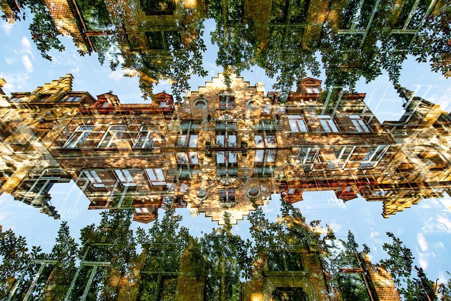
If you were to only take a fleeting glance at the photograph, you might not immediately understand what you were looking at. That also applies to most photographs in this collection. This photographer has a knack for gently asking you to take a beat and concentrate on what you are looking at.
Classic Car #13
Most of the subjects in this list of double-exposed images are buildings or landscapes, but on this occasion, the focus is on a classic car. Seeing as they are classic cars, their shapes are interesting and lend themselves to this type of work.
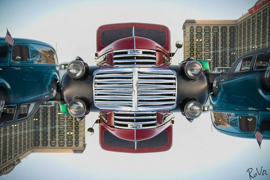
The context is removed, and in a way, it doesn’t even matter what we are actually looking at. What’s important is the forms shown and how they all fit together and combine to form an image that is interesting and unique. This would make the perfect gift for a car buff!
Miami Beach Station #07
We love the colors depicted in this double exposure. There is something almost carnivalesque about the structure we are looking at here. The spikes on the roof remind us a little bit of Sonic the Hedgehog! Or is it Lisa from The Simpsons? Regardless, you know what we’re talking about.
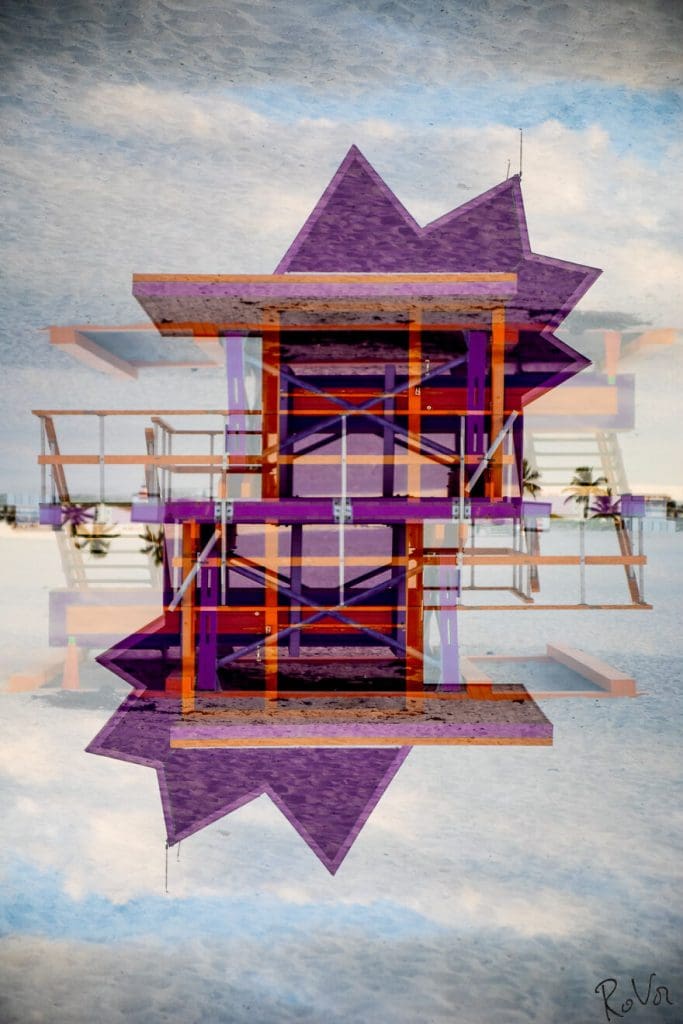
We really like the way the wooden struts and planks interlock with each other. This is another point of interest in this photograph. There is something almost hallucinatory about it, which we think greatly contributes to its brilliance. The vague shadows give it an eerie feel as well.
Paris, Grand Palais #1
In this image, shadows play across the marble floor and become an integral part of the scene. The soft undulating curves of the golden railings give the photo a very gentle aesthetic quality. Light and shade also work together in perfect harmony.
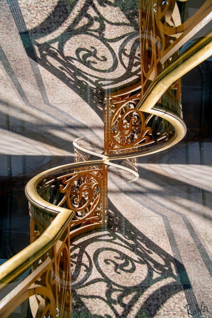
It is quite the stunning photo. When you take your time looking at it, the more you see hidden within the frame of the photograph. It is another fantastic example of the versatility that the photographer is able to demonstrate.
Stockholm #16
This is a really interesting city scene. The tiers of the building are structured in such a way that they become an integral part of what the image actually is. The different levels each have their own points of interest that are hard to ignore.
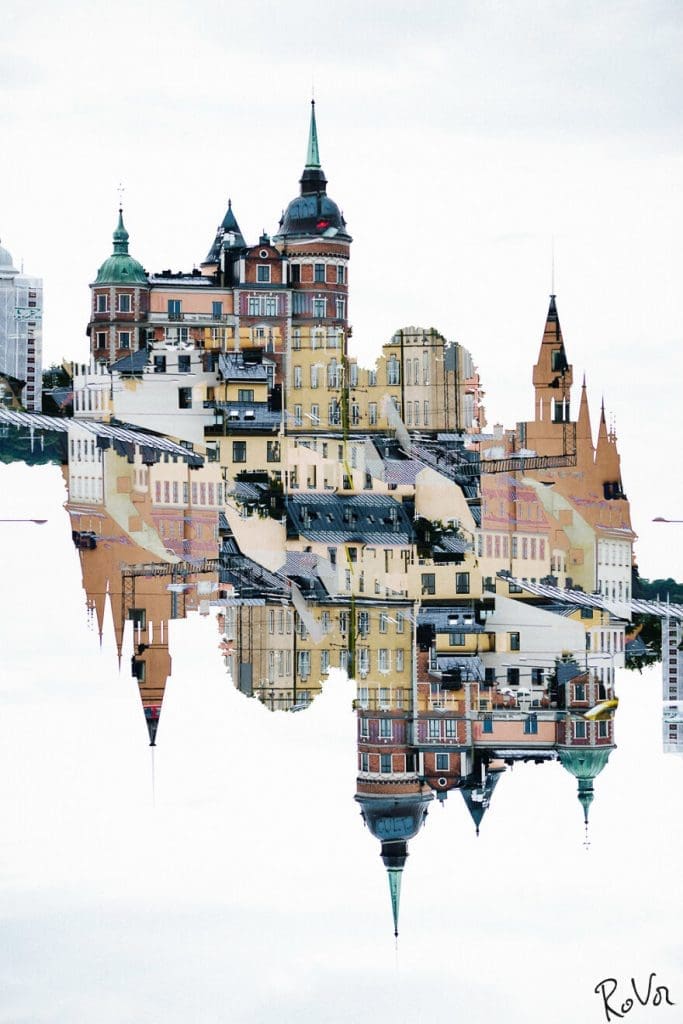
The color scheme patchworked across the photograph gives it a really solid sense of texture and structure as well as imparting the image with a sort of mythical whimsical feeling that is hard to define. We didn’t think Europe could look even more beautiful than it is.
Iceland Waterfall #8
We love this one. The waterfall reflects and inverts which gives the impression that it is corkscrewing around and continuing its downward plunge. It’s an impressive feat of photography that makes you almost feel the cold mist in the air.
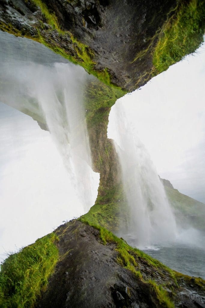
It is a wonderfully evocative photograph that gives off a real sense of place that is conveyed within its frame. The reflection caused by the double exposure seems to be a natural extension of the reality depicted by the photographer.
