
When Data Meets Art: 35+ Interesting Charts That Make Information Pop
In the vast ocean of information, data visualization acts as a guiding light, assisting us in navigating the complexities of intricate concepts and making the abstract more understandable. Visual representations have the unrivaled ability to convert raw data into a compelling narrative, elucidating patterns, trends, and relationships that might otherwise go unnoticed. In this day of data overload, having graphical representation tools that simplify and clarify our knowledge is critical.
So, in this article, we feature a handpicked collection of 45 exceptional graphs and charts that summarize data in fascinating ways, providing new views on various topics. From things like the appearance of music notes in water to societal events, these aesthetically appealing representations serve as windows into the world of data-driven insights. Thus, prepare to travel on a visual trip as we unravel the riddles and reveal the enthralling stories hidden behind the surface of raw data.
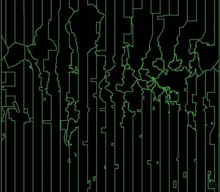
Unveiling the Air Current Atlas
Behold the Air Current Atlas! It is a quirky global map that discards land or water and celebrates the other invisible force, air, to define our planet. This masterwork depicts the delicate dance of air currents, which forms the outlines of nations in a mesmerizing shade of blue.
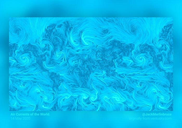
It showcases a world where the unseen brushstrokes of air create borders. As we gaze at the blue tapestry of countries, we are reminded of the natural forces that bind us. From the playful whirlwinds to the whispers of secrets, this map urges us to enjoy the invisible beauty around us.
Rise and Shine
This graphical representation is a call out to all geography buffs and eccentric décor fans! You’ll be astounded by the way innumerable tiles are stacked one after another to curate this US Elevation Canvas. Although it looks like a LEGO creation, it highlights the country’s beauty and magnificent landscape.
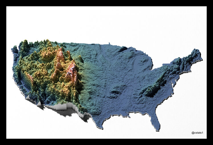
From the breathtaking heights of the Rocky Mountains to the rolling plains of the Midwest, each tile upholds a distinct geography that characterizes different locations. No wonder it’s a visual feast that sparks discussion and brings the beauty of nature into the home.
The Wacky Linguistic Limbs
Once upon a time, in the beautiful world of the science fiction webcomic Stand Still, Stay Silent, where viruses ran wild, and adventures awaited, a fascinating representation known as the Language Family Tree existed. This unusual artwork, created by the renowned artist Minna Sundberg, adorned the webcomic pages, attracting viewers’ attention from around the world.
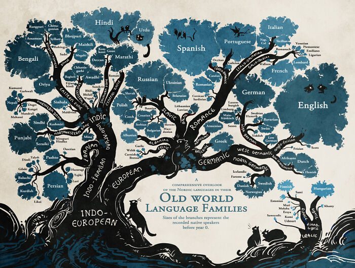
This tree is unique because it shows an interesting network of relationships between different Indo-European languages. So, fear not if you ever find yourself wandering aimlessly amidst the lush vegetation of the Indo-European wilderness! Simply referring to this Language Family Tree will save you!
Celestial Comedy
Space and the solar system have always been a topic of interest, but they mostly remain enigmatic to most. So, we’ve come up with a solution to the planetary puzzle — the Solar System Map. From the elusive Mercury to the massive Jupiter and beyond, each planet’s location is portrayed with a playful twist.
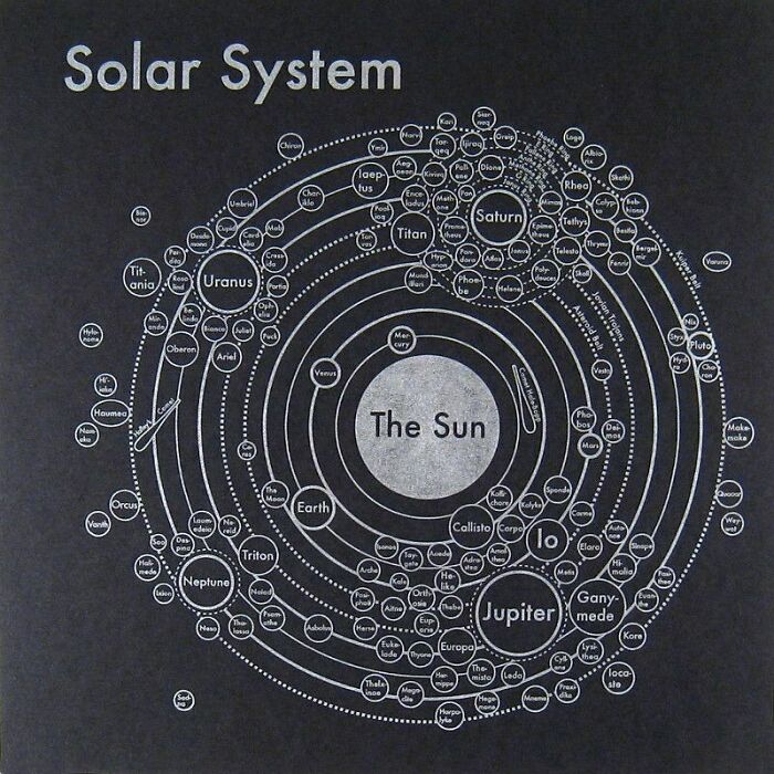
This map takes us on a thrilling adventure full of humor, intrigue, and celestial connections. Be it the planets, moons, comets, or asteroids, it provides a hilarious view of each element of our solar system. So, prepare for a cosmic scavenger expedition with this map’s quirky and crude renderings of heavenly phenomena.
From Sorcery to Spectacle
The contrasting colors in these Harry Potter movie Barcodes give a clear understanding of the different moods the two directors wanted to set amongst the audience. As evident from the left Barcode, Chris-Columbus wanted to render bright vibes with a vibrant setting, portraying the beginnings of a beautiful adventure.
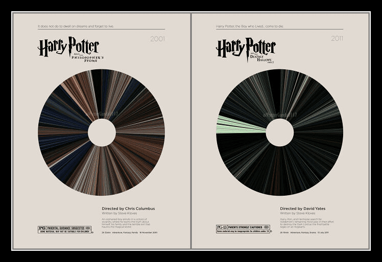
On the contrary, David Yates infused darker tones and more subdued colors to showcase a world still cloaked in mysteries. This difference in the two movies’ direction and set-up displays the changing filmmaking trends. However, the colors whisper secrets in either case, encouraging us to discover Hogwarts’ hidden treasures.
A Shipshape Cartographic Marvel
Each line, curve, and contour in this nautical masterpiece is fashioned from the delicate dance of ships that sailed the high seas in 1945. It’s a symphony of maritime movement and an artistic production inspired by the arrivals and departures of vessels of different shapes and sizes.
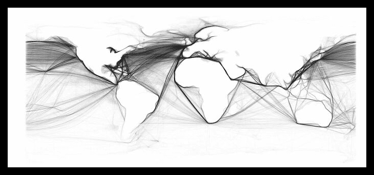
To be clear, this map isn’t merely a fanciful piece of art for aesthetics. Instead, it is a treasure mine of historical data on the operating ships during the last year of World War II. It’s like a time machine, transporting us to a moment of postwar revival and worldwide commerce.
Tool’s Musical Maze
With versatile albums, the American rock band, Tool takes listeners on a diverse musical journey. Each song featured here has a range of tones, from melancholic intros to thundering crescendos. But do you know that apart from music, they also foster diversity in the duration of their tracks?
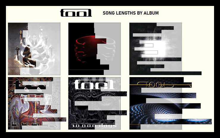
This Musical Maze showcases the song lengths of Tool’s six popular albums, namely “Opiate,” Undertow,” “Aenima,” “Lateralus,” “10,000 Days,” and “Fear Inoculum.” From long songs to short compositions, their musical repertoire features a medley of durations. Thus, you can expect to enjoy a distinct yet compelling experience while listening to each album.
The Chromatic Compass
Let’s explore the convoluted network of streets and alleyways of Central London with humor and imagination. This unique graphical representation brings the city’s orientation to life in a kaleidoscope of colors. While East-West and North-South streets are red, roads running in other directions have varied shades of blue, green, and purple.
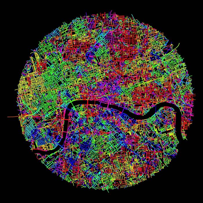
With a burst of vivid colors, this 10km circle upholds the chaotic street network of a bustling city like London. Thus, whether you’re looking for the famed Regent Street or the ancient Strand, this vibrant street layout will lead you through the city with a dazzling appeal that cannot be overlooked.
Crack the Code with Google
In a world where dots and dashes hold the power of communication, Google rose up to the occasion with its excellent Morse Code Guide. Join us on a whimsical adventure as we investigate Google’s Morse Magic and unravel the puzzles of this enigmatic language.
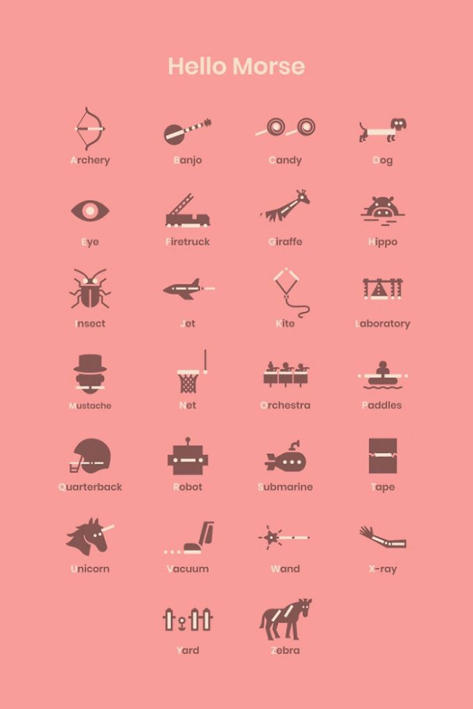
This guide makes the world a playground of hidden messages and interesting mysteries. From novices grasping the skill of tapping dots and dashes to professional codebreakers solving complex problems, Morse Code’s power can be utilized in many ways. So, get ready to tap, beep, and decode with Google’s Morse Code Guide!
Avatar: Circle of Elements
Prepare to relive the enchantment of the renowned series, Avatar: The Last Airbender in a fresh and aesthetically appealing way. Here’s a frame-grab sequence of all the show’s episodes, arranged clockwise with season 1 as the inner circle and the finale season as the outer circle.
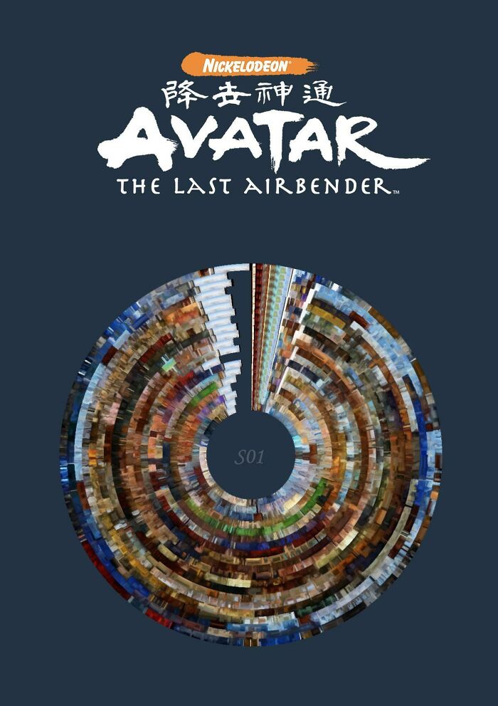
These frames capture every laughter-inducing moment and heart-pounding feat of the series. From the exhilarating fights between Aang and Zuko to the surprising disclosures and narrative twists, this circular portrayal will take you on a rollercoaster trip of action and tension.
Picasso’s Kaleidoscope
Step inside Picasso’s fantastical universe as we begin a creative voyage unlike any other! This infographic comprises the most recurrent themes used in over 8000 Picasso works. Following the same techniques, colors, and shapes used by the famed artist, this infographic is brought to life in the master’s distinctive style.
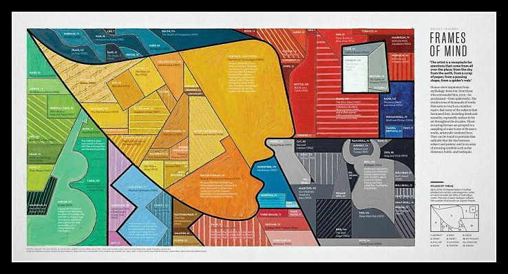
Picasso’s paintings depict a wide range of emotions, from Cubist portraits with shattered features to abstract visages that push the bounds of form. With timeless faces, defiant curves, and impossible contortions, his artworks continue to enthrall and inspire people even today. Thus, this infographic serves as a true tribute to the maestro!
Madrid Routes
If you’re planning to visit Spain and want to explore the central capital of the country, this Madrid Route map will be your ideal guide. You can find hidden jewels and savor the thrill of a leisurely walk among the colorful energy of the streets of Madrid as you follow the vivid yellow routes.
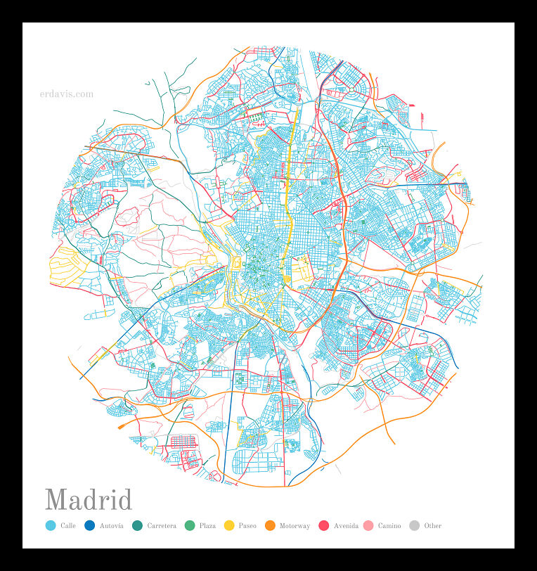
The green lanes will lead you to famous plazas to shop, while the brilliant orange roadways will take you through the transport hubs. You can also go along the dark pink-hued streets to witness the city’s grandeur and elegance. That said, most of Madrid has bright blue-hued streets, encapsulating the spirit of city life.
The Quirky World of Remote Proximity
From the pink, crimson, and maroon hues indicating faraway locations to the surprising white marks showcasing proximity, enter a world where colors tell a story of remoteness like never before. You’ll have to travel 40-70 miles to find the next road on these pink and scarlet swaths, making them the remotest places in the US.
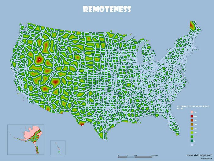
However, you can find the next road in about 5-30 miles if you reside in green-shaded areas, turning them into moderately remote locations. Thus, only people living in the white-colored regions of the USA will have maximum accessibility to transport facilities, with the next road being one mile away.
I, Me, and Moby-Dick
Dive into the literary terrain of Moby-Dick, a novel by the famous American writer Herman Melville. This graph upholds an interesting representation of the number of times “I” got mentioned in the novel’s chapters, transforming the visualization into a beautiful painting of storytelling enchantment.

The X-axis counts the chapters, and the Y-axis refers to the number of “I” mentions. While the towering red bars indicate the excessive use of “I” at the initial and mid-chapters of the novel, the large empty space where the red lines vanish represents the chapters with no reference to “I.”
Melodic Miracles
Prepare to be amazed as music and physics clash to create an awe-inspiring symphony for both the ears and the eyes. You’ll be pleasantly surprised as each solo note takes on a life of its own, changing into a stunning mandala artwork right before your eyes.
Like a conductor, the piano sets the tempo, and the water replies with its elegant ripples. High notes generate intricate designs reminiscent of delicate lacework. In contrast, low notes produce strong, grandiose structures that compel attention. It’s indeed a breathtaking sight, each note forming a one-of-a-kind masterpiece.
A Neutrino Snapshot from Earth’s Shadow
This incredible photography achievement is sure to tingle your heavenly senses! Take a look at the sun’s image in the night obtained not with light but with elusive neutrinos. These are enigmatic particles that readily transcend matter, conveying important information about celestial bodies like the sun.
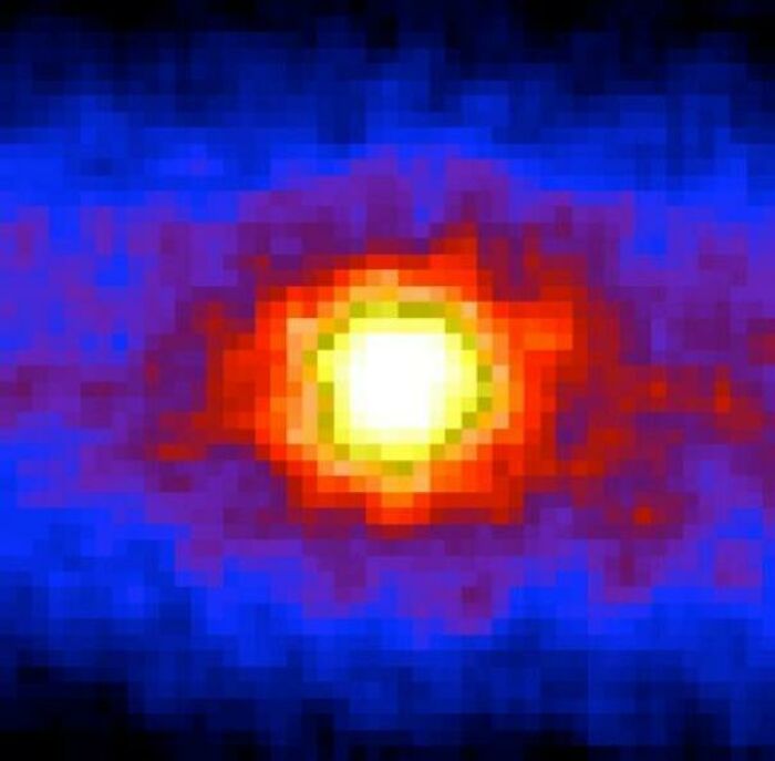
Each small particle delivers its own symphony, a whisper from the sun’s core. Scientists examine these ethereal notes, deciphering the sun’s secrets from afar. As we gaze past the Earth’s shadow and watch the flux of neutrinos, we develop a greater respect for the invisible forces that form our cosmos.
The Vibrant Palette of Colors in David Foster Wallace’s “Infinite Jest”
Here you can see all the colors mentioned in David Foster Wallace’s book, Infinite Jest. It is a vibrant literary canvas painted with multiple colors to enrich the tale. Wallace’s superb use of color excites the senses and immerses readers in a familiar yet extraordinary world.
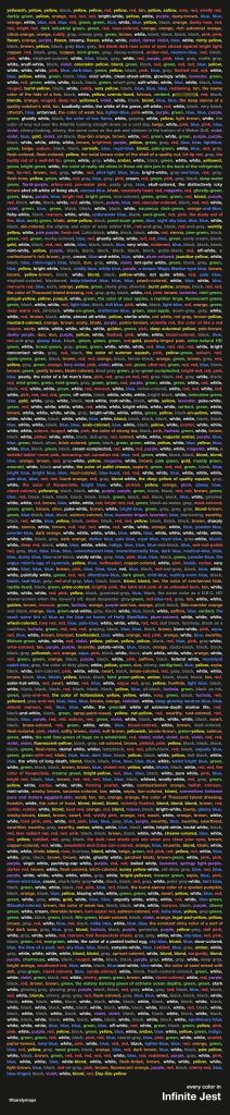
From everyday shades and chromatic intrigue to unusual emotions and colors beyond the visible spectrum, the diverse palette anchors us to the novel’s realism. Whether it’s the subtle greys of concrete walls, greens of groomed lawns, or the omnipresent blues of the sky, these colors serve as a backdrop for the story’s spectacular occurrences.
Mickey’s Empire
Explore the fascinating network of businesses controlled by The Walt Disney Company as we enter the enchanted world of Mickey Mouse. Get ready to be astounded by the range and diversity of enterprises housed within the contours of Mickey’s famous silhouette.
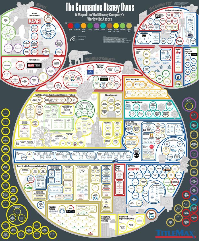
From Walt Disney Pictures and Pixar Animation Studios to Marvel Studios and Lucasfilm, every creative powerhouse in the empire of Walt Disney enthralls viewers. This is where heroes, princesses, and talking animals come to life, enchanting our hearts. So, uncover this vast kingdom’s wide array of businesses and celebrate their glory.
The Chromatic Odyssey of 2020 Academy Awards Contenders
An average color timeline of the 2020 Academy Awards candidates comes to life in this image. Each film has its own color narrative, from the strong and vivid to the delicate and subdued. It’s a fanciful trip around the cinematic spectrum, with the colors corresponding to each frame of the movie.
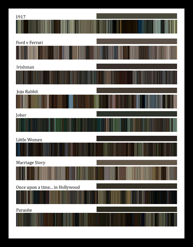
This timeline demonstrates the visual prowess of the award contenders, from monochrome moments conveying the depth of emotions to technicolor successes taking us to fantastic realms. It showcases how the colors of every scene of the nominated films changed over time, promoting varied moods, transmitting different narratives, and leaving an indelible impression.
Illuminating Ireland’s Coastal Charm
This is a fanciful adventure over Ireland’s gorgeous coastline, where towering lighthouses stand tall, guiding ships through perilous waters. These coastal guardians provide a bit of whimsy to the rough coastlines with their precise timing, mesmerizing flash patterns, and vivid colors. So, don your sailor hat and delve into this kaleidoscope of light!
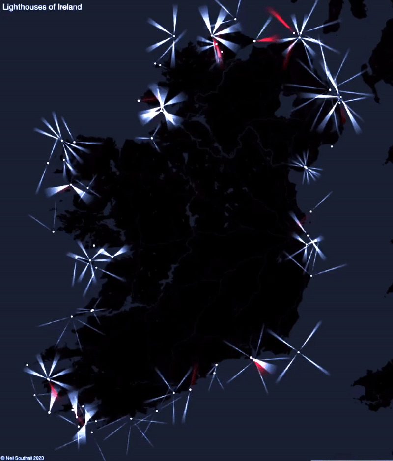
These lighthouses shine even brighter when storms rage, daring the waters to challenge their supremacy. Particularly, the ones flashing red lights signify danger and warn mariners to avoid those places. Unlike other colors, red lights do not blind human eyes in the dark, and this is why they are used in high-risk zones.
Hoops Heatmap
Feel the fire as we delve into the tumultuous realm of NBA shot allocation. It showcases the blazing hot zones of prominent NBA players’ shoots, allowing fans to tour the court lands where these legends left their imprint. From long-range shooters to mid-range masters, let’s uncover the secrets hidden inside their shot charts.
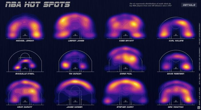
Examine how players like Michael Jordan, LeBron James, Kobe Bryant, Kevin Durant, Stephen Curry, and Dirk Nowitzki could shoot from anywhere on the court, shining on both offensive and defensive strategies. However, the shot charts of other players were compact and refined, making them good at either defense or offense tactics.
Unveiling the Cosmic Data Artistry of the Star Wars Expanded Universe
If interplanetary systems and space-related movies interest you, check out this data art inspired by the Star Wars fictional universe. It unravels the cosmic depths of Wookieepedia, where creativity meets encyclopedic knowledge. The different shades of colors used in the artwork to resemble various characters of the franchise further add a playful twist.
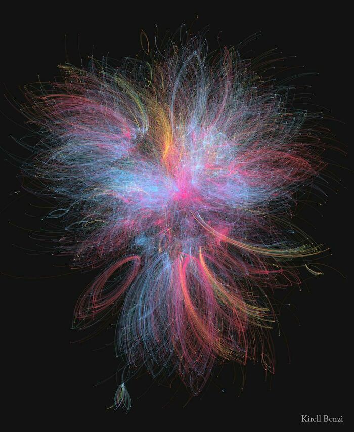
The blue streaks represent the Jedi, Rebellion, Republic, and the energies associated with the lighter side of the Force; the yellow hue portrays criminals and bounty hunters; and the red nodes correspond to the Sith and Empire. Lastly, the most powerful characters, Emperor Palpatine and Anakin Skywalker, lie in the artwork’s center.
Against the Backdrop of a Sunset
Do you love natural vistas and the beauty they evoke? Then, you’ll surely be awestruck by this ingenious graphical representation. The picture depicts a stunning view of a scenic sunset and a lone boat rowing through the river’s waters. It is even suffused with the vibrant orange of the setting sun for aesthetic appeal.

That said, this artwork is also a data chart thanks to the distinct hilly backdrop. It indicates the exponential growth of Tesla’s stock prices over ten years. It starts as an imperceptible line on the left but eventually grows to reach a jagged peak towards the right, indicating the recent surges in their stock price.
Roomba’s Technicolor Tango
Step up and marvel at the enthralling wonder — A Roomba vacuum cleaner with a color-changing LED on top! It’s a beautiful ballet of light and motion where the modest Roomba takes center stage, fascinating spectators with its funky color-changing light. It moves forward on a planned course until an unforeseen contact breaks its trajectory.

The longer the device is exposed to the floor for cleaning, the more prominent colored paths are generated using LED lights. It not only gives a vibrant display of colors but also showcases the remaining dirty spaces. Thus, Roomba cleaners add a touch of elegance as well as efficiency to their mission of cleaning.
ChronoCarta
Get ready to go on a unique time-bending adventure as we explore the fascinating realm of the “ChronoCarta!” This map of current time zone borders reveals a funny patchwork of temporal distinctions, where laughter collides with uncertainty, and timeliness takes on new meaning.
With code strings and time rings, a programmer brought the ever-shifting dynamics of time zones to life. It shows how some large countries have no division of time zones while tiny areas have a fraction of an hour difference in time zone borders. Although it seems strange, these factors typically make time zones more complex.
A Tasty Journey to Peri-Peri Delight
Are you a die-hard fan of Nando’s grilled chicken? If yes, here’s a colorful depiction of how close these peri-peri pleasures are to your place. From delectable brown and flaming red to healthy green and bland grey, each color on this UK map represents the closeness of a Nando’s outlet to the local citizens.
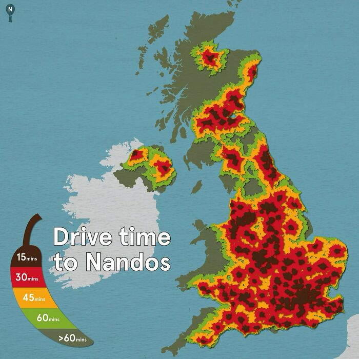
Although people in the brown and red zones are the luckiest to access Nando’s easily, those from the yellow and green areas aren’t unfortunate either. They only have to drive 45-60 minutes to relish their favorite delicacies. But for those in the grey-marked regions, they have to drive for over an hour for this treat!
Peaks and Patriotism
The recognized elements of Colorado’s flag — the vivid red, white, blue, and golden sun — blend effortlessly with the precise geographical lines here, forming the backdrop of the breathtaking mountains. It’s a visual symphony in which patriotism and natural beauty collide, reminding us of the deep bond between the land and its people.
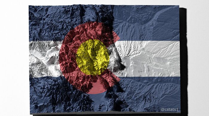
From the craggy peaks of the Rocky Mountains to the meandering canyons and huge plains, the flag serves as a doorway to the natural wonders that distinguish Colorado. This topographic flag is indeed a tribute to the state’s natural beauty and the daring spirit it inspires.
A River of History
Meandering in a true river-like fashion, this laser-mapped infographic depicts the rich history of the Mississippi River through the years. The map is shaded in a unique way reminiscent of the color palette one could associate with the canyons along which the river flows.
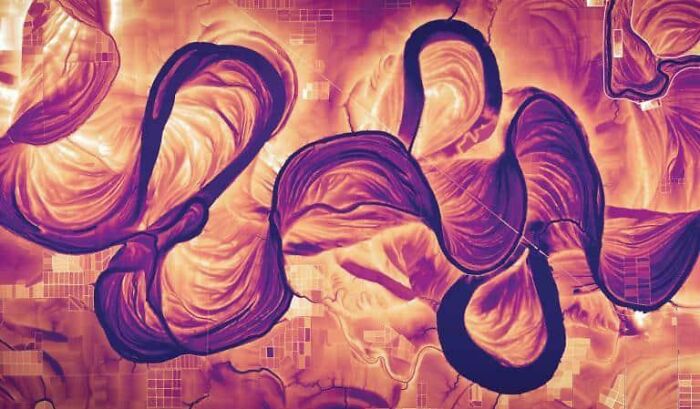
While regular data charts have jagged peaks and pointy bottom ends, this one features rounded and curved edges, resembling the waves of Mississippi. Additionally, the distinctive silhouette and texture of the illustration render an eccentric visual experience, highlighting the river’s change of course over time.
Revealing the True Size
You’ll be amazed at this Real Proportions map that breaks free from distortion, unveiling the real scale of all land surfaces, including all countries, territories, and key islands. With this revelation, all the preconceived notions about Earth’s geography are put to the test.
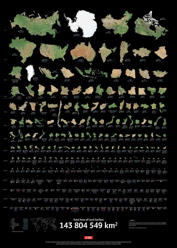
This map unravels the hidden giants that have been lurking in the shadows. Those wide areas considered small before suddenly dominate the stage, and the world comes into focus. Boundaries and sizes coincide, giving us a new perspective on the actual size of our planet’s landmasses.
Centered Connections
These lines extend forth like playful tendrils from the UK’s center, connecting to the geographic centers of every nation on the Earth. Each line is embellished with brilliant colors, indicating the compass points of the countries they link to. It’s a visual extravaganza that piques the interest and sparks the imagination.
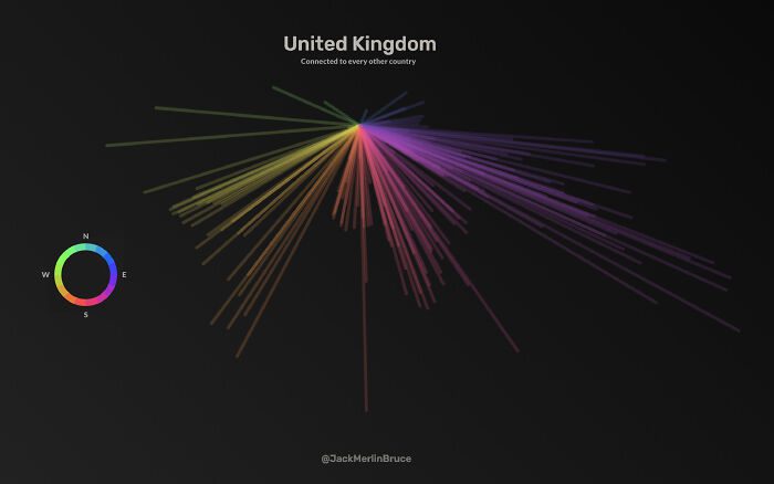
From deep purples on the East to earthy browns and golden yellows over the West, each color transports us to nations rich in history, culture, and diverse landscapes. With a burst of colors and a touch of artistic creativity, it’s an enthralling trip across countries from this European nation.
From Hierarchy to Hilarity
Next, we look into the artistic brilliance of an employee who dared to defy the standard organizational structure and convert it into an aesthetic masterpiece in this story of hierarchy-turned-humor. The artist sought to challenge the mundane routine and infuse creativity into the job.
The org chart is no longer a strict hierarchy but a whimsical landscape of interrelated departments and functionalities designed in a chandelier-like style, thanks to the light strokes and a vivid palette. Thus, this graphical representation is sure to transform the boring office into a vibrant workplace.
Star Wars Films in a Cosmic Disc
As you traverse through the outside rim of these galactic discs, you will witness the opening frames of each Star Wars movie. But as you move inward, you will eventually come across the following scenes of the films with the end credits in the center.
The rings are denoted by their average colors, setting the mood and narrative of each frame. Thus, exploring these discs will give you a concise yet appealing visual trip to the films. Although this could act as a spoiler for someone who understands it perfectly, it’s an asset for a Star Wars fan.
Canadian Smarties Conundrum
Chocolate lovers and candy aficionados, prepare for a tantalizing narrative that will tickle your taste buds and leave you in awe! We’ll embark on a fanciful voyage into the enthralling world of Canadian Smarties and their perplexing color distribution through eight distinct categories.

However, it’s crucial to know that this color dispersion is not only a result of sugar anarchy. Instead, Canadian Smarties have a secret code and sophisticated formula established by sugar magicians to ensure that each sweet is a joyful surprise to you!
Paris Through Time
Discover the age of buildings in Paris with this colorful map index. From the delicate greys of old secrets to the vivid reds of modern wonders, this image serves as a record of the city’s development and the legends hidden behind its walls.
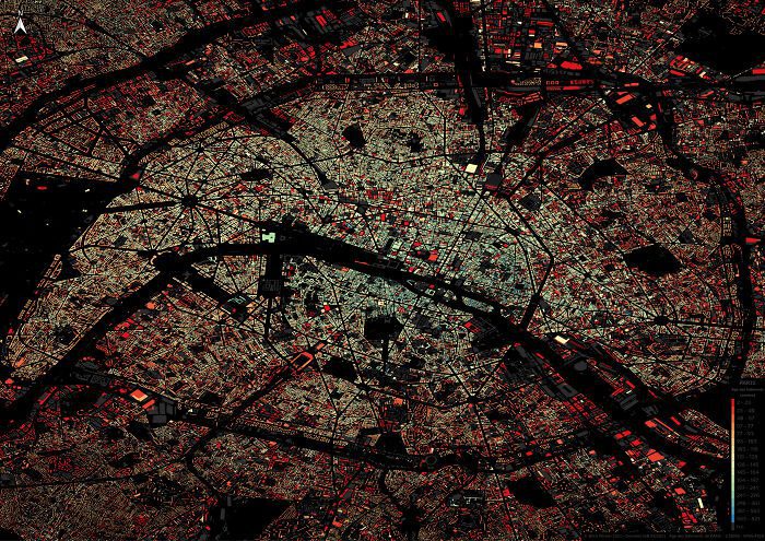
So, enjoy the beauty of contrast, savor the timeless stories, and let the colorful trip lead you through the brilliant tapestry of Parisian architecture. This vibrant journey from millennia-old structures to contemporary establishments will transport you across time and enlighten you about the city’s rich past.
The Finnish Bear Population
Bears are the national animals of Finland. Hence, depicting their population on the country’s map by adding little animated bears is befitting. This entire map is composed of cartoon bears of varying sizes and colors, all clustered together to form the geopolitical boundaries of the nation.
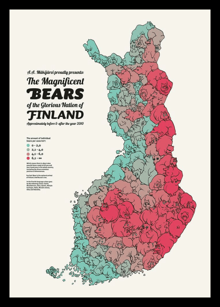
Each zone corresponding to a specific color represents the respective bear density. The map showcases how people living on the country’s eastern side and the Finland-Russia border must be more cautious than those on the west coast. Due to the high bear density, encountering the animal is a common scenario in the former case.
Seattle’s Parking Ticket Tales
We delve into the beauty of the red pillar rising — Seattle’s attention-demanding parking penalties. These colorful representations of vehicular offenses attract attention from the bustling metropolitan streets of the city. With their strong font and flawless formatting, they convert ordinary pieces of paper into surprising wonders of graphic design.
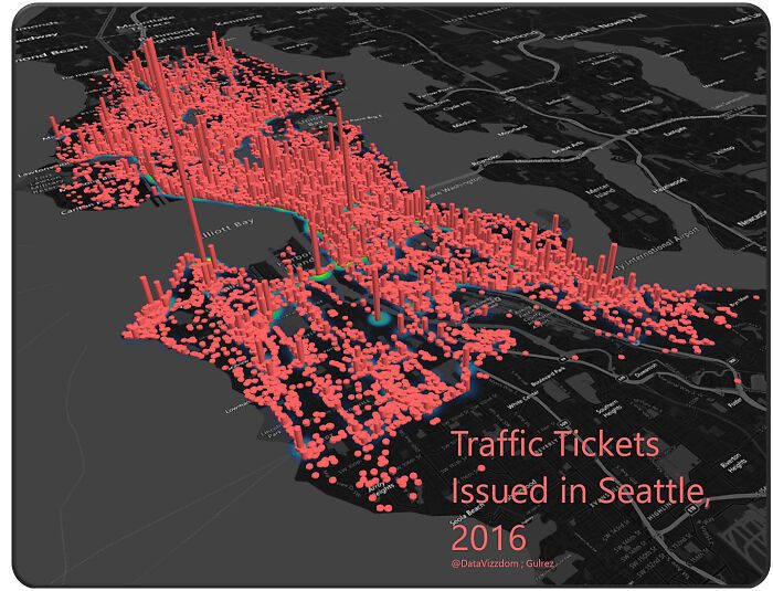
Parking penalties, like a finely orchestrated ritual, serve as a reminder of the city’s order and its endeavor to strike a delicate balance between parking availability and enforcement. It’s a performance that combines accuracy, timing, and a touch of finesse.
Assembling the Superhero Squad
Take a look at the comically mismatched team memberships of Marvel’s famed superhero squad. From the improbable Avengers and the mutant mayhem of X-Men to the cosmic oddities of the Fantastic Four and the street-level silliness of Defenders, these misfit teams highlight a funny relationship that makes the Marvel Universe so interesting.
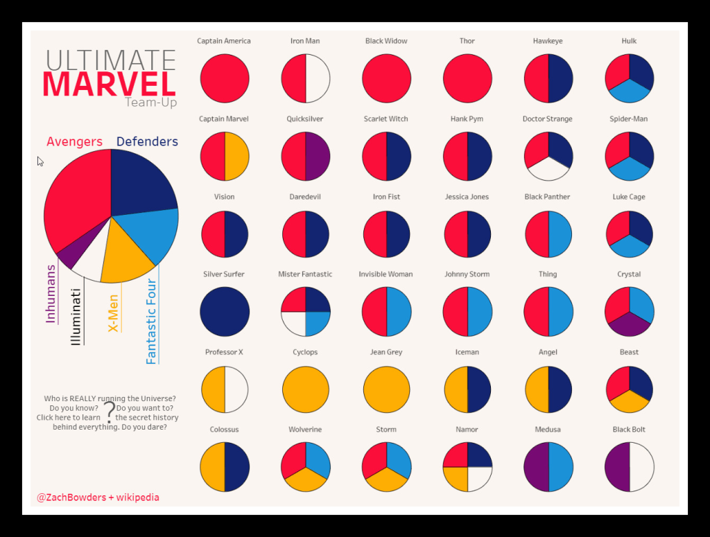
Whether it’s the strong and mighty Thor, tech-savvy Iron Man, the ever-lovable Hulk, or the agile and acrobatic Spider-Man, this motley ensemble of superheroes brings together varied skills, personalities, and egos. Thus, it showcases not only versatile stars playing a part in more than one team but also dedicated heroes exclusive to a specific team.
The Chromatic Space Odyssey
Prepare for a surreal cosmic voyage as we explore the colorful universe of 2001: A Space Odyssey! In this enthralling graphic representation, we’ll reveal the brilliant colors that paint the canvas of Stanley Kubrick’s renowned masterwork. Each hue in the disc corresponds to the average colors of the movie’s frames.
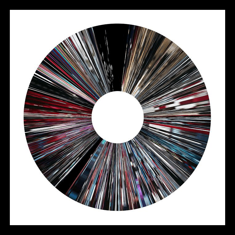
Kubrick’s excellent use of intense shades like pulsing reds and electric blues in contrast to void black heightens the film’s visual impact and elicits a feeling of amazement in every scene. These colorful bursts urge us to contemplate the wonders of the cosmos while traveling across time and space.
Canine Superiority in Terms of Temperament
From the magnificent German Shepherd to the charming Labrador Retriever, these breeds rule the dog territory in terms of adulation and devotion. Their enduring popularity has made them household names and sought-after companions. However, when it comes to temperament, they hold a middling position.
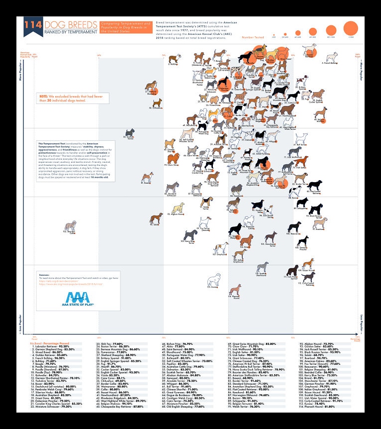
This chart of 114 dog breeds reveals a charming tapestry of their personalities with respect to their popularity. From canines with a moderate temperament to those with a perfect equilibrium of mood, each breed has its own character. It’s surprising that some unexpected jewels have a better-balanced temper than most common breeds.
Stars and States
This one-of-a-kind American flag is a patriotic masterpiece that blends geography, population, and a touch of whimsy. The stars in the flag are sized proportionally to each state’s population and accurately positioned in the enormous tapestry of the United States.

While the largest star on the left represents the splendor of California, the little one on the right corner betokens the tiny Rhode Island. Thus, this unique take on the American flag reminds us that variety exists not only in the people but also in the fabric of the country.
Crayola Transformation
From modest origins to a rainbow of colors, join us as we unfold the intriguing tale behind the famous crayon brand, Crayola. We’ll dig into its vivid world and observe its astonishing evolution through decades with a dash of exuberance and creativity.
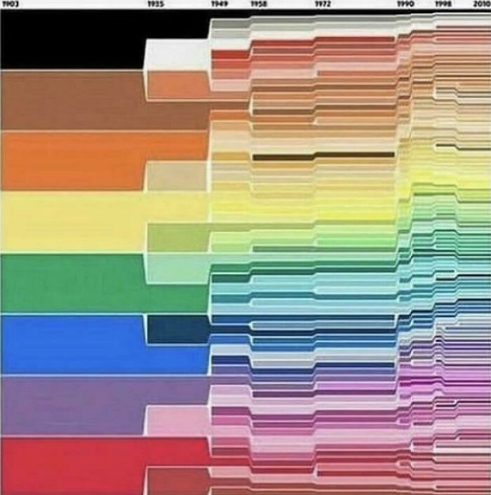
With the progression of the company, Crayola’s color pallet transformed significantly. From eight standard colors to as many as 100 hues, the brand added a wide range of shades in just 100 years. It increased its repertoire, providing a kaleidoscope of options to ambitious artists, young and old.
Chat Chronicles
Step into the enchanted realm of conversations between two lovebirds. Using WhatsApp chat analysis, a guy turned his and his partner’s years of communication into an alluring poster that recounts the story of their love, laughter, and shared experiences. It showcases how the couple’s relationship evolved with time and strengthened itself.
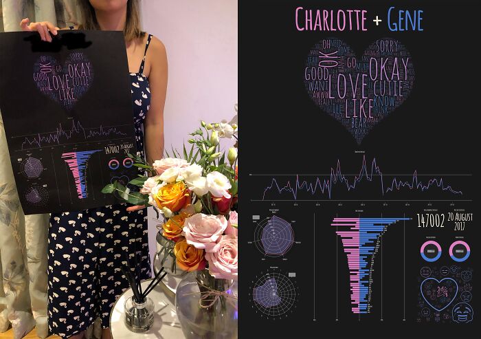
From the most used words and emojis to the number of hourly and weekly messages shared by each, this conversation analysis reflects the couple’s journey of two years on a single piece of paper. It not only reminds them of their cherished moments but also upholds the milestones of their relationship.
Interplanetary Jamboree
Here is yet another interesting celestial data art for all astronomy buffs and space explorers out there! It shows how the whirling and twisting of Mercury, Venus, Mars, Jupiter, and Saturn along their orbits would look when seen from the Earth.
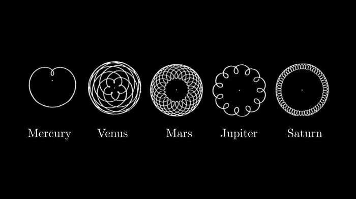
Since all these planets lie on the same ecliptic plane as the Earth, their movement produces sleek lines flowing back and forth. Thus, looking more like the mathematical roulette curves drawn by a Spirograph, these traced paths are one of the finest depictions of natural geometry!
Bitcoin’s Spiraling Spenders
Let’s traverse back through the history of Bitcoin transactions with this heat map. From the first time Bitcoins were originally acquired to their latest spending binge, this chart showcases the number of people buying cryptocurrencies, accumulating them over time, and finally spending them.
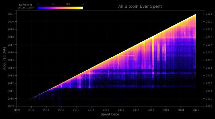
Thus, this ascending graph proves that more people will opt for cryptocurrencies over time. The current rise of decentralized finance (DeFi) and non-fungible tokens (NFTs) have already marked the advancement of Bitcoins, but they will unlock endless possibilities for global trade in the near future.
Luminous Waters
A rainbow of fluorescent colors breathes life into Italy’s Riverine map. From the magnificent Po River in the North and the meandering Arno River of Tuscany to the dazzling Adige River in the East and the lovely Tiber River of Rome, each basin is bathed in its own distinct glow.
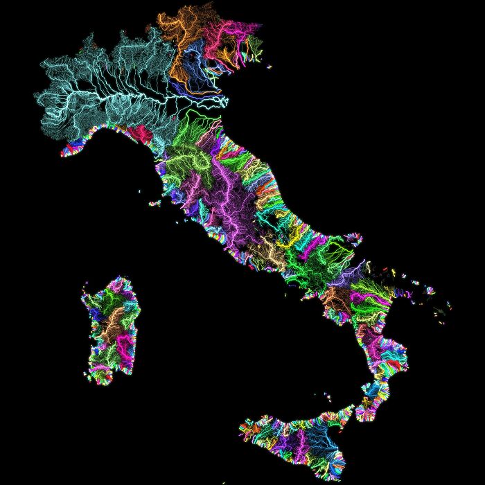
While solid vibrant colors characterize each river’s course, a symphony of fluorescent lights illuminate the respective basins. So, whether exploring hidden jewels along the riverbank or following neon-lit pathways to busy waterfront neighborhoods, these river basins serve as a guidebook for adventure and discovery.